
By Catherine Austin Fitts
My “go to” website for technical analysis of precious metals, the US dollar & the US stock market is Rambus Chartology, where Rambus (that’s his handle – he’s the founding technical analyst) leads a discussion with extensive charts of what the markets are saying.
In January 2016, Rambus launched his quarterly Solari Report with a Blockbuster Chartology. You can find links to the entire series of quarterly and annual Blockbuster Chartologies at the end of this latest piece.
One of the reasons that Rambus is so good at his craft is that he focuses on “staying on the right side of the major trend.” The challenge of doing so at this time is that it is tempting to look for bottoms or to assume that the trend upwards in the US dollar or stock market may be over. However, Rambus consistently brings us back to the discipline of the Chartology. What does price tell us? As he describes so aptly, we are dealing with psychological warfare.
Sitting back once each quarter to get this perspective offers invaluable insight. So, here we go for the Annual Wrap Up 2021 Blockbuster Chartology!
Blockbuster Chartology Quarterly Report
By Rambus
~ 2021 Annual Wrap Up ~
Interest Rates and Inflation
Commodities
US and World Stock Markets
Interest Rates and Inflation
There are two fairly new important trends developing in the markets. The first and newest trend that is beginning to exert itself is interest rates which are now in the process of breaking out from a one year triangle that is part of a bigger H&S reversal pattern.
The other important trend which has been in place for a while now is the commodity complex which is showing strong inflationary pressure taking hold. When you add these two pieces of the puzzle to the overall market environment they are suggesting we may see a flight to safety to some degree.
Lets start with interest rates by looking at a daily chart for the TNX, 10 year treasure yield, which is in the process of breaking out from a one year triangle consolidation pattern last week. That one year triangle consolidation pattern is actually the right shoulder of a bigger H&S bottom.
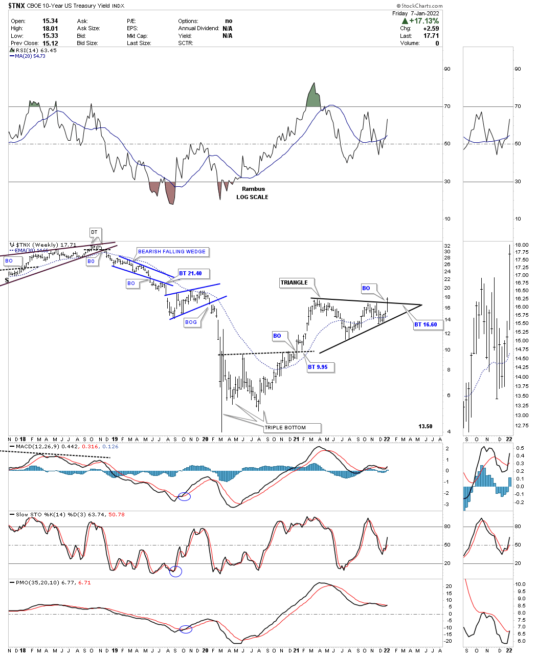
This longer term weekly line chart for the TNX shows a pretty large inverse H&S bottom. As you can see the triangle on the daily chart above it the right shoulder for the inverse H&S bottom. The breakout on the daily chart above is also part of the breakout above the neckline, two breakouts for the price of one.
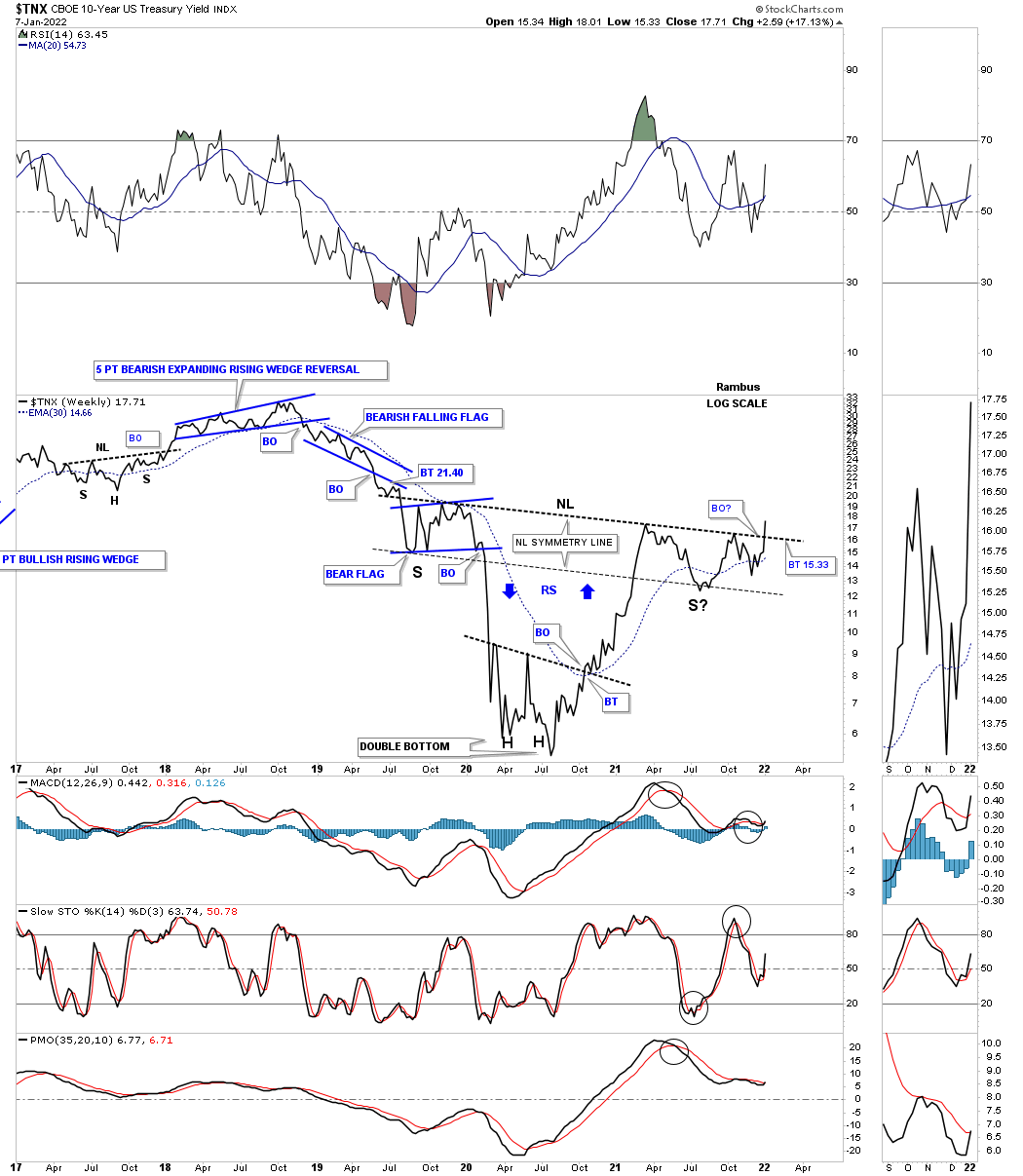
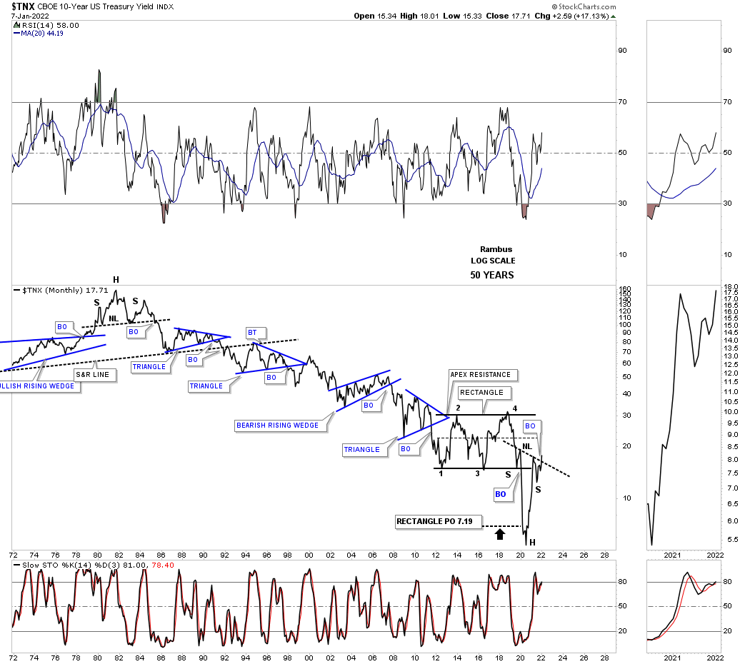
It is always very important to put the context of a large pattern into perspective. Everyone knows interest rates have been trending down for a very long time. Below is a 50 year line chart for the TNX which shows that 40 year decline in interest rates. Note the H&S top that reversed the previous rising trend in interest rates in 1980. Now look at the bottom of this 50 year chart where you can see the inverse H&S bottom that we just looked at on the weekly line chart above.
The last consolidation pattern to have formed in the 40 year downtrend was the blue rectangle which had a price objective down to the 7.19 area which also suggests this could be a very important low in interest rates especially with the price action now trading above the bottom rail of the blue rectangle. The two H&S reversal patterns are a perfect bookend for the 40 year decline.
Next is a combo chart which has the TYX, 30 year yield on top with the TNX on the bottom. The black rectangles, that are exactly the same height, measures each trend channel of the 40 year downtrend. Note how once the now center dashed midline gave way the channel basically double in size to the bottom. The TNX formed a third channel before putting in its H&S bottom. One could even call the hard move down to the bottom rail a capitulation move because of its magnitude.
The TNX has just broken out from its H&S bottom but the TYX still has more work to do on completing its right shoulder. Again, notice how the center dashed midline held support for the right shoulder low reversing what had been support for most of the 40 year decline to support once again on the breakout and right shoulder low.
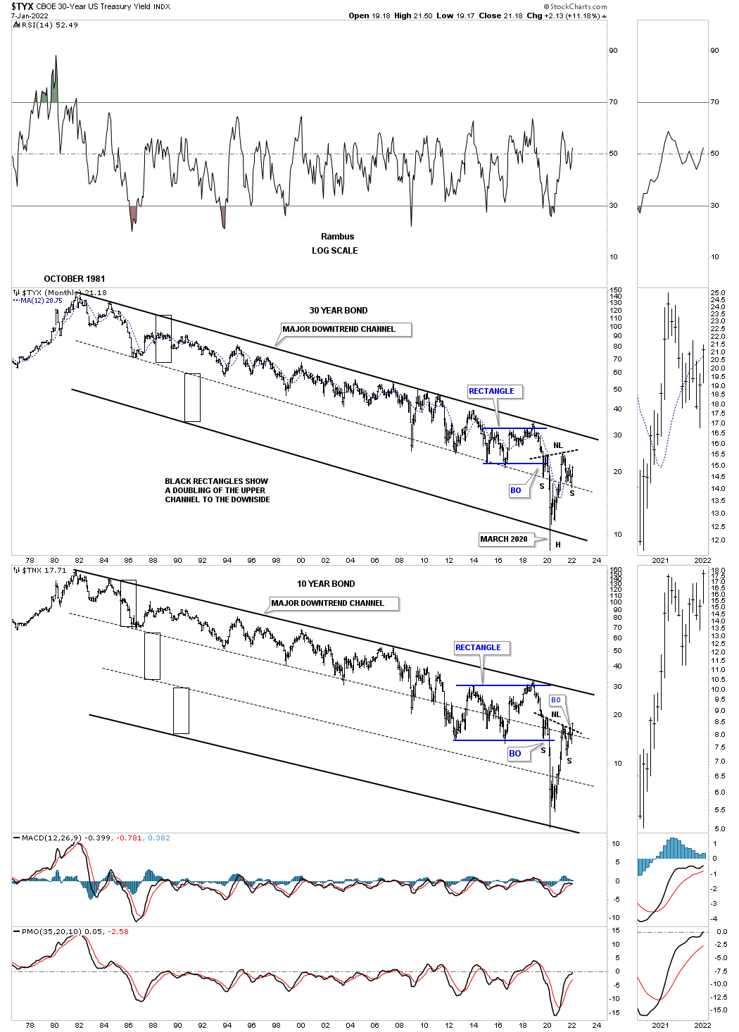
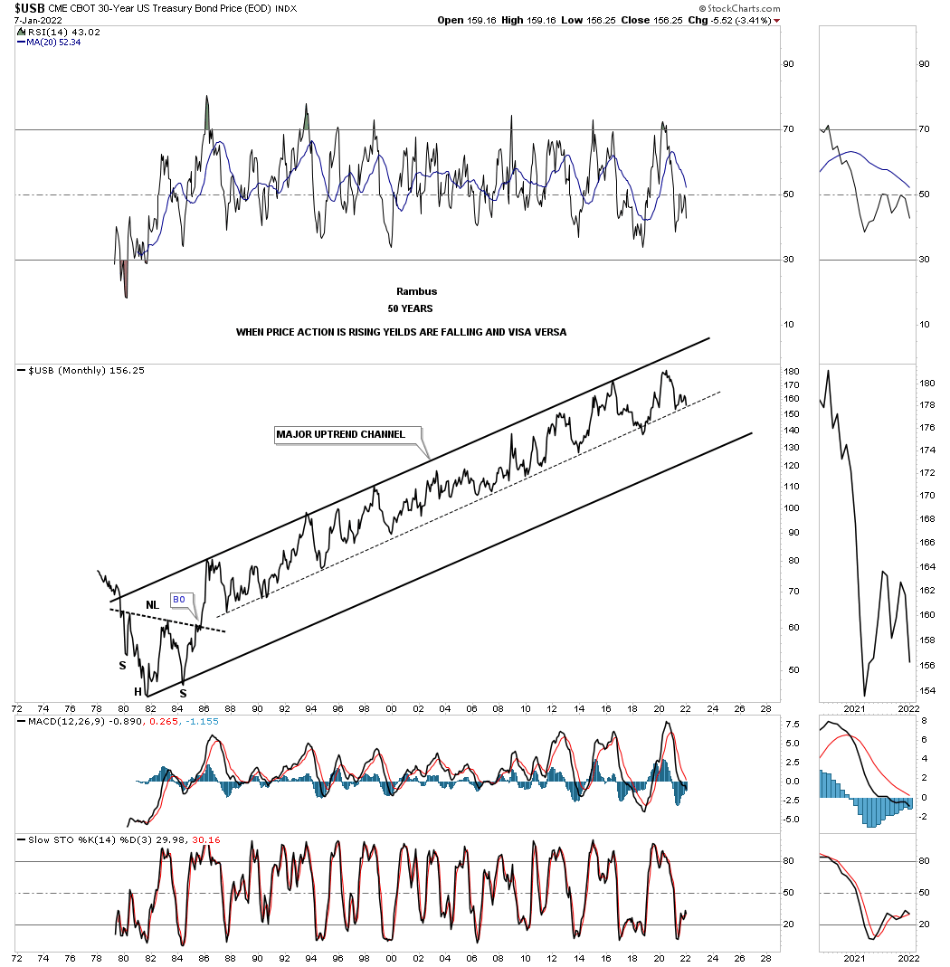
This last chart for interest rates shows the USB, 30 year bond, sitting right on the center dashed midline. A break below that center dashed midline would most likely result in a move to the bottom of the 40 year rising channel which would mean higher interest rates.
As this chart and the combo chart above show is that to really get a reversal to a sustained rise in interest rates we would need to see the 40 year trendlines give way. The price objectives for those two H&S bottoms on the TYX and the TNX above are strongly suggesting the top rail is going to give way and higher interest rates will be part of our world for years to come.
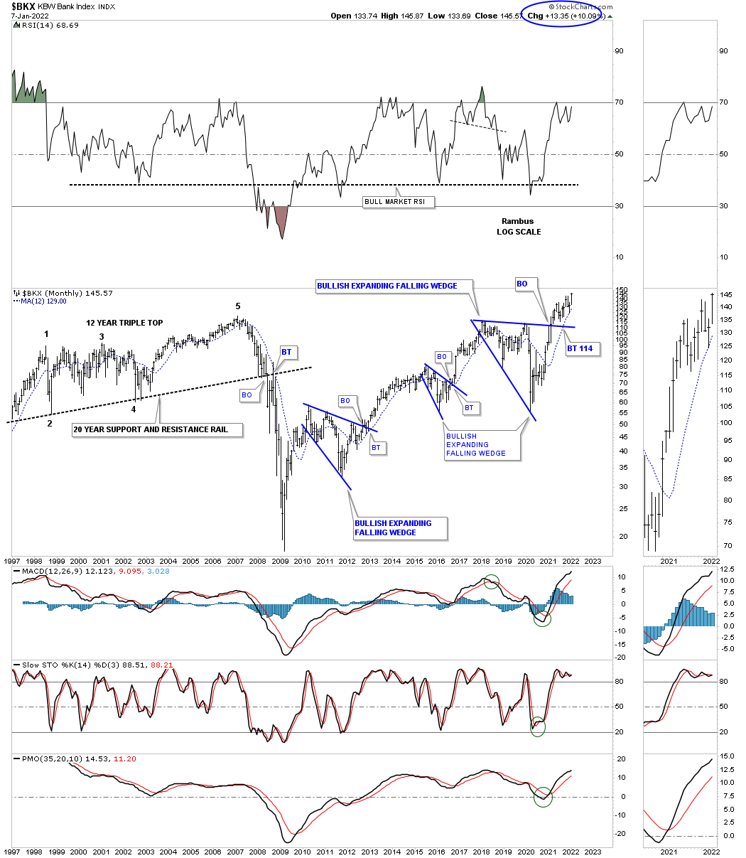
If higher interest rates are going to be with us for the foreseeable future then banks should benefit which is already showing up in the BKX, Bank index, as it is trading at a new all time high.
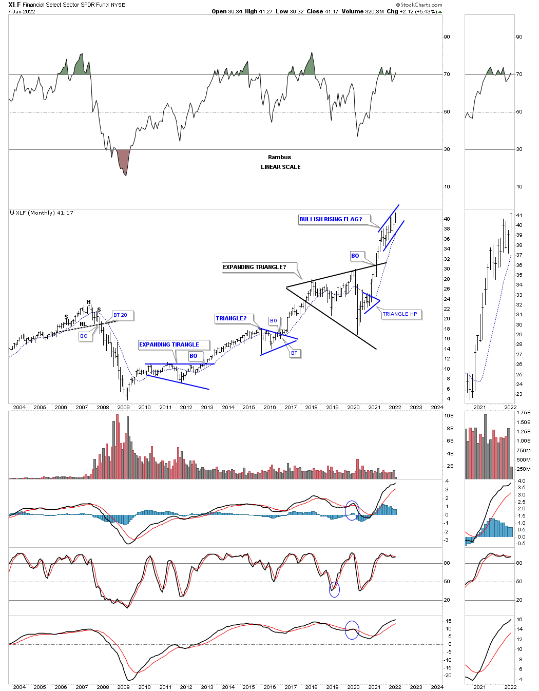
The XLF is a finanical etf which is forming a possible bullish rising flag.
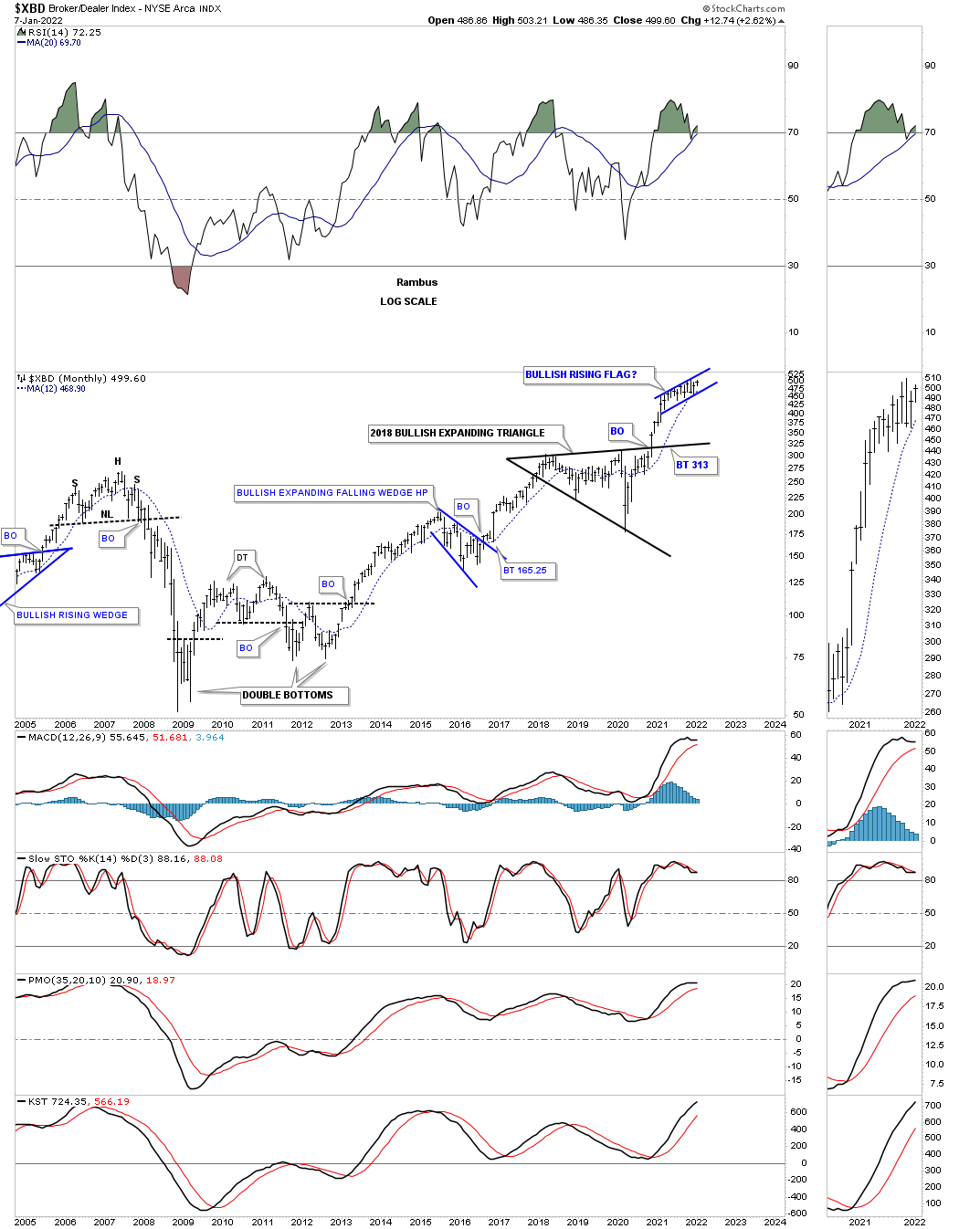
Another area that should do well with higher interest rates for example is the XBD, brokers and dealers index, which has been forming a possible bullish rising flag or running correction.
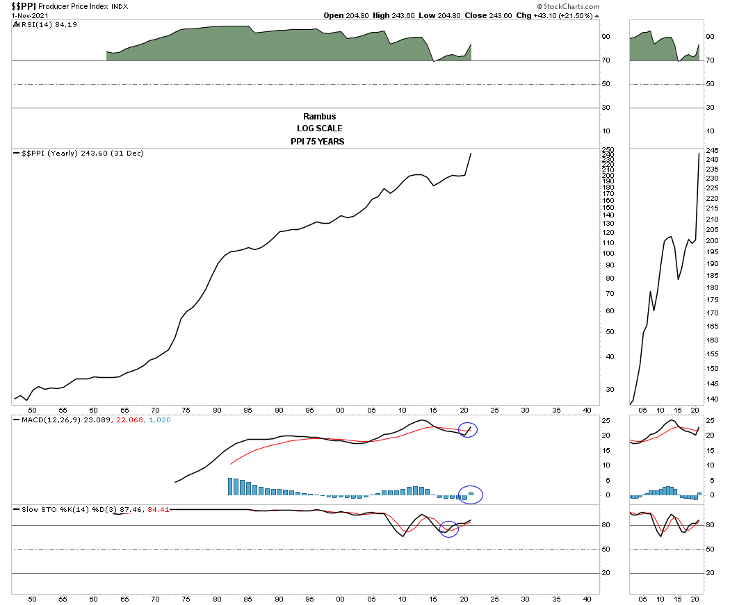
Most of the time when the FED begins to raise interest rates they are trying to slowdown inflationary pressures on the economy. There are many ways to look at inflation or deflation but using the PPI, Producer Price Index, is one way. Below is a 75 year, yearly line chart that shows inflation is always with us to some degree which is a fact of life.
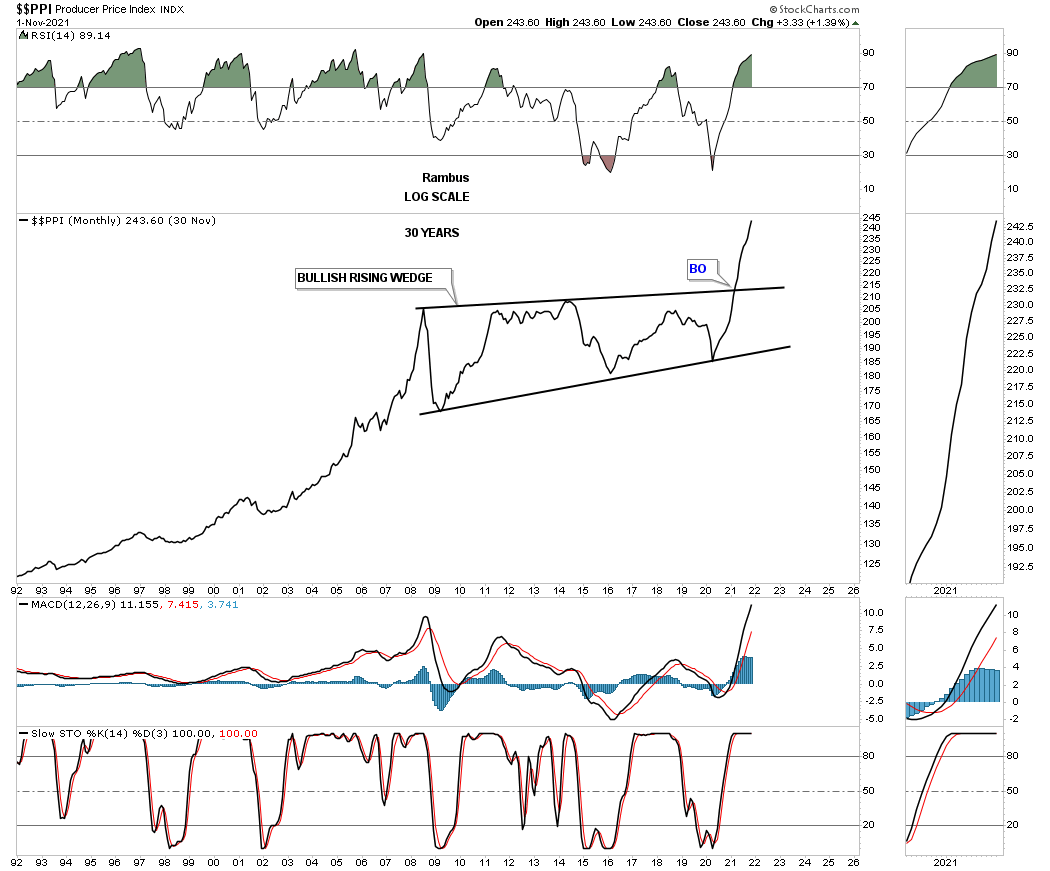
There are times though when inflation is much stronger than other times which is a good thing to know so you can prepare for it. Below is a 30 year monthly line chart for the PPI which shows the breakout this year from a very large bullish rising wedge with the previous low forming at the 2020 crash low. That very large consolidation pattern is strongly suggesting inflation is in a new important leg up unlike the chopping action during the formation of the rising wedge.
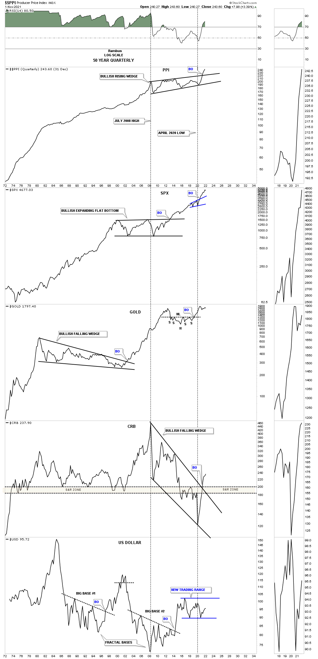
This next chart is a 50 year quarterly line combo chart which has the PPI on top with SPX, Gold, CRB and the US dollar on the bottom. This combo chart shows you what these indices like to do during an inflationary phase. As you can see the SPX doesn’t seem to mind too much along with Gold. The most interesting chart is the CRB index which is just breaking out from the 2008 bullish falling wedge.
Keep in mind when looking at these charts that they are long term in nature and changes come slowly but changes do come especially at important inflection points which seem to be in place right now.
In Part 2 we’ll look at many different commodity charts to see if they are showing rising inflationary pressure. To say we are living in interesting times is an understatement. All the best…Rambus
Commodities
In part 2 of the Weekend Report we’ll look at the commodity complex to see if they are confirming that inflation is real or just a figment of our imagination. We’ll focus on the longer term charts so we can see where and how the 2008 bear market came to an end. There will be plenty of blame to go around on why inflation is taking hold but the charts below will show you that is was time for a new secular bull market regardless of all the reasons we’ll hear.
Normally during the end of a big move in a stock for instance, there will be a capitulation move where the price action can go parabolic that ends the move which can be on a short term or a very long term scale which is relative to the time scale you are looking at. These types of moves can signal a new bull or bear market as well. Again, it all depends on what time scale you are looking at.
Tonight we’ll look at some long term commodity charts to see if they can give us any information regarding the inflation or deflation debate that seems to be on a lot of investors minds right now especially with all the stimulus being pumped into the economy. Being able to spot a major trend change early on can help us get on the right side and hopefully take full advantage of what of the situation presents to us.
Part 2 Commodity Indexes:
This monthly chart for the CRB index shows you some nice Chartology with several measured moves as shown by the blue and red arrows. The CRB index traded at a new high since the 2020 bear market low this month.
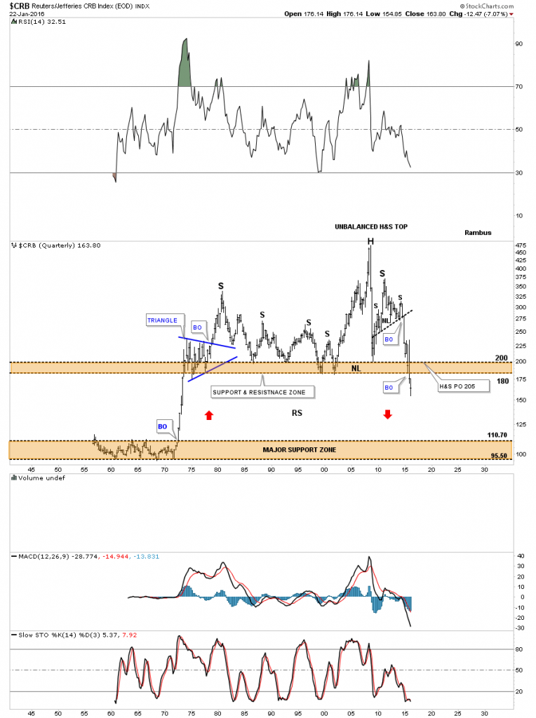
Since this is part of the Quarterly Report I would like to show you a long term quarterly chart for the CRB index I posted back on June 22, 2016 and my comments at the time.
June 22, 2016:
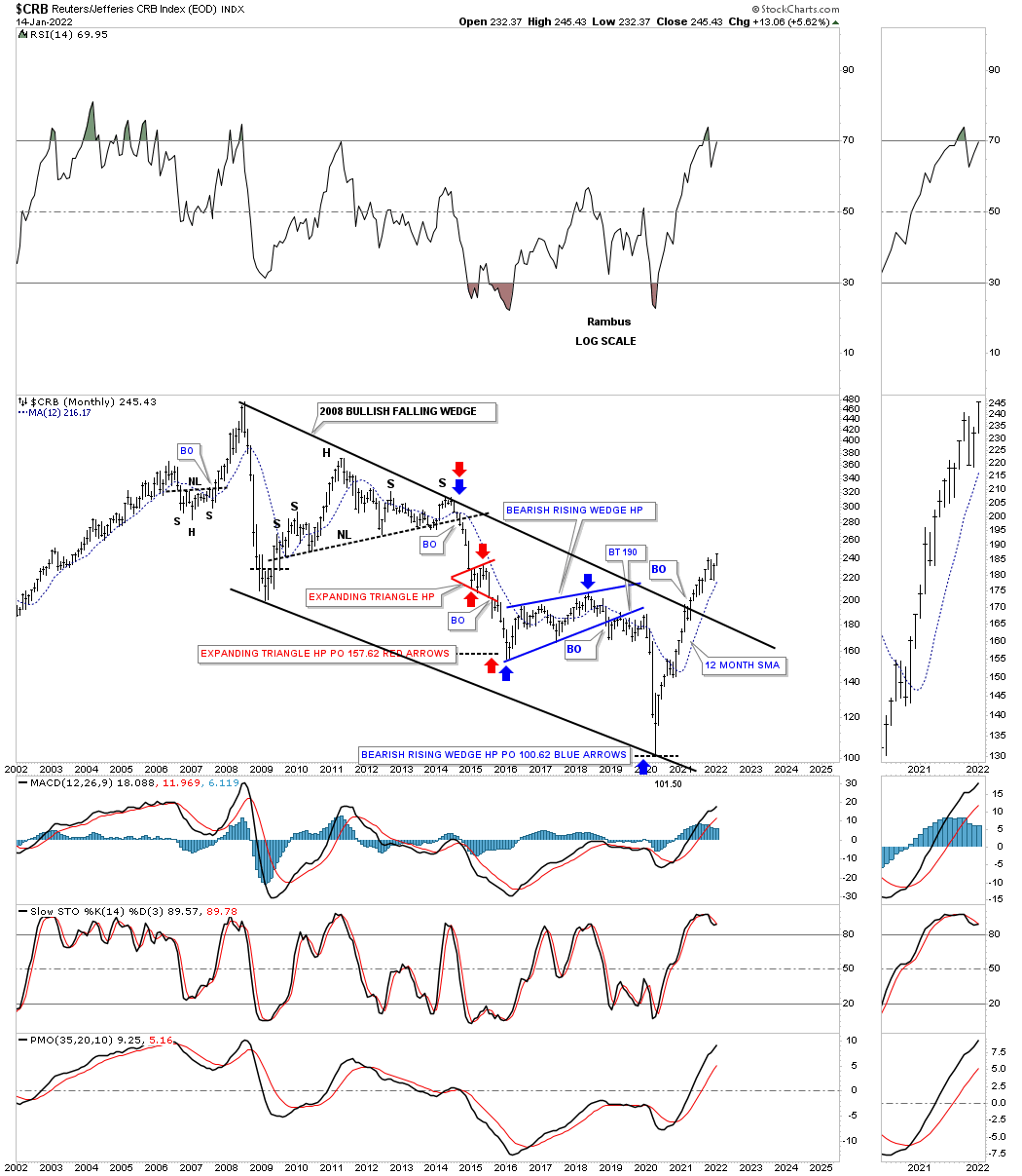
This last chart for the CRB index is a 60-year quarterly chart which goes all the way back to 1955 so there is a lifetime of history to look at. Up until the early 1970’s the CRB index traded in a very narrow trading band between 110 and 95 or so. Once the price action broke above the top of the trading range it was a straight shot up to the beginning of the blue triangle. For over forty years the CRB index traded above the top brown shaded S&R zone until fairly recently. Keep in mind this is a quarterly chart which takes three months to complete a bar.
You can call the price action above the brown shaded S&R zone anything you’d like, unbalanced H&S top, double top or anything else that may come to mind. It’s the brown shaded S&R zone which is the most important thing to grasp about this chart. For over 40 years it held support and now it’s broken to the downside. This suggests it should now reverse its role to what had been support to now resistance on any backtest from below.
One last feature on this long-term quarterly chart below and that is shown by the red arrows. Back in the 1970’s when the CRB index broke out above the lower brown shaded S&R zone it went vertical. I’ve been showing this chart for sometime now which suggests we may see some reverse symmetry back down over the same area as the vertical rally up in the 1970’s. When I first posted this chart the price action was still trading above the brown shaded S&R zone. I’m still amazed when I look at this chart and see the price action trading below the brown shaded S&R zone which is at its lowest point since the 1970’s. How it plays out is going to be interesting to say the least. Back to the future comes to mind .
CRB index 2016:
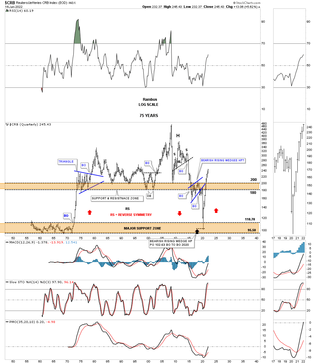
Now compare the current 2022 quarterly chart for the CRB index to the 2016 quarterly chart above. Note the red arrows which shows what I call reverse symmetry. How a stock goes down in a strong impulse move you will generally see a similar move on the way up. The reason being is that there were no important consolidation patterns made on the way down so there is little overheard resistance on the way up over that same area on the chart. I was able to add the red arrow pointing up on the far right hand side of the chart which is reversing symmetry on the way up over the same area. Again, there was little overhead resistance so the CRB index has rallied strongly out of the 2020 bear market low.
CRB index 2022:
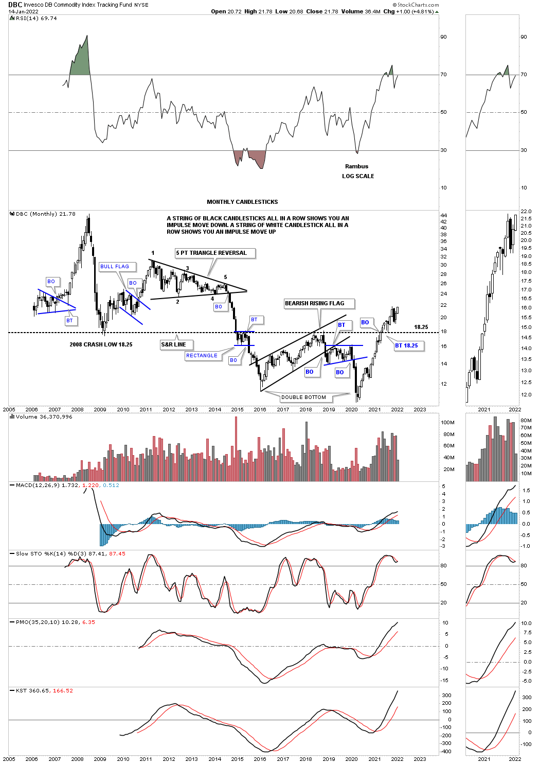
The DBC commodity index shows its secular bear market putting in a large double bottom reversal pattern. Note the long term S&R line, support and resistance line, which stretches all the way back to the left hand side of the chart. Notice how the price action either traded above that very important S&R line or below it. In early 2021 the price action broke back above the S&R line with a quick backtest to complete the breakout. Its secular bull market is really just beginning.
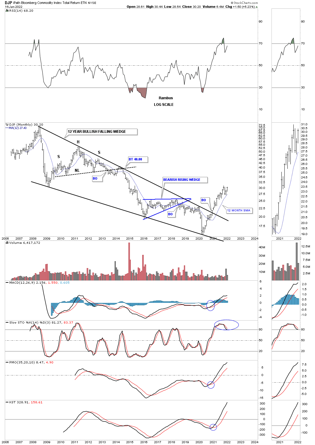
The DJP, Bloomberg Commodity index, broke out from its massive 12 year bullish falling wedge early in 2021 and hasn’t looked back.
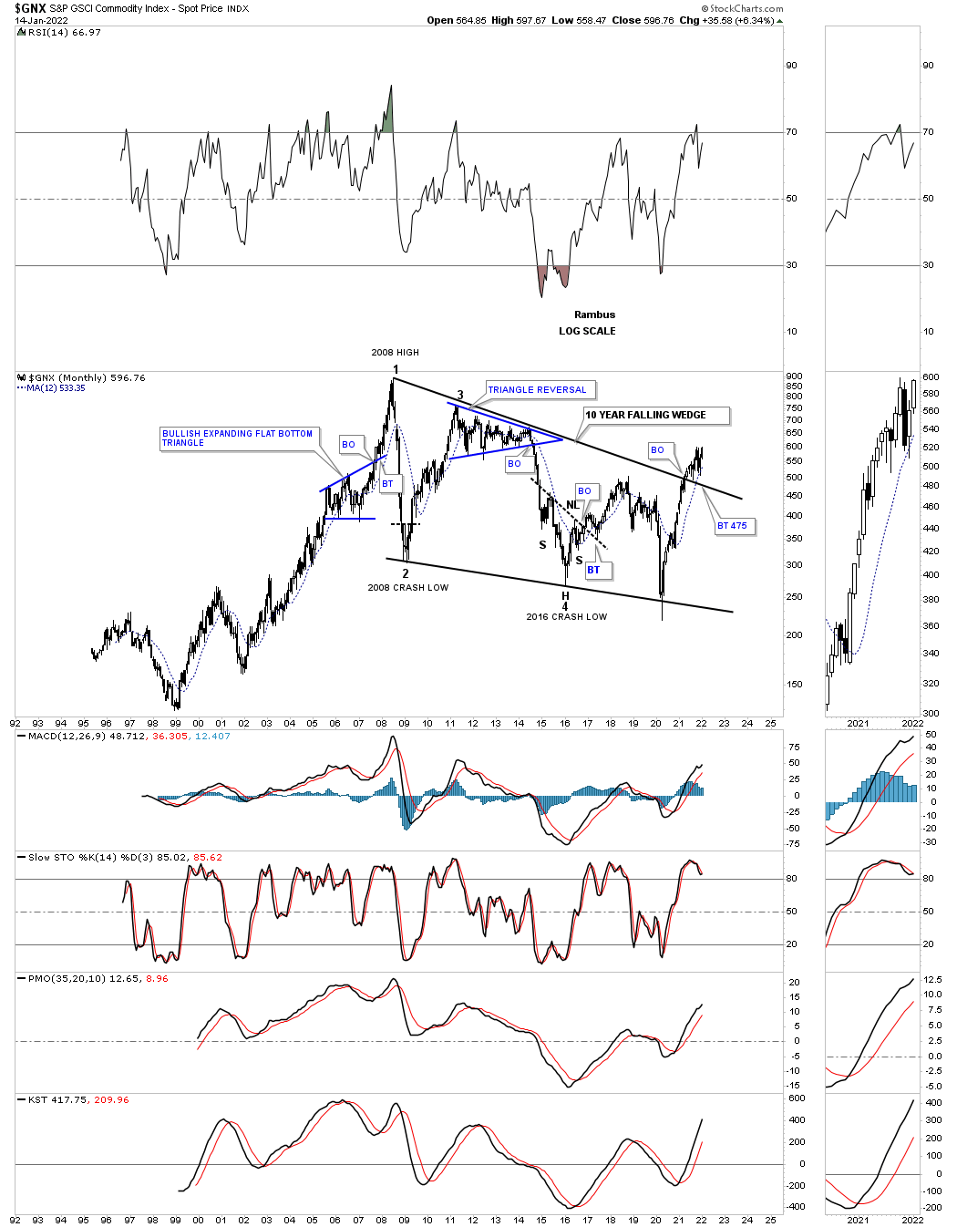
The GNX commodity index broke our from a large bullish falling wedge with a backtest to the top rail in place.
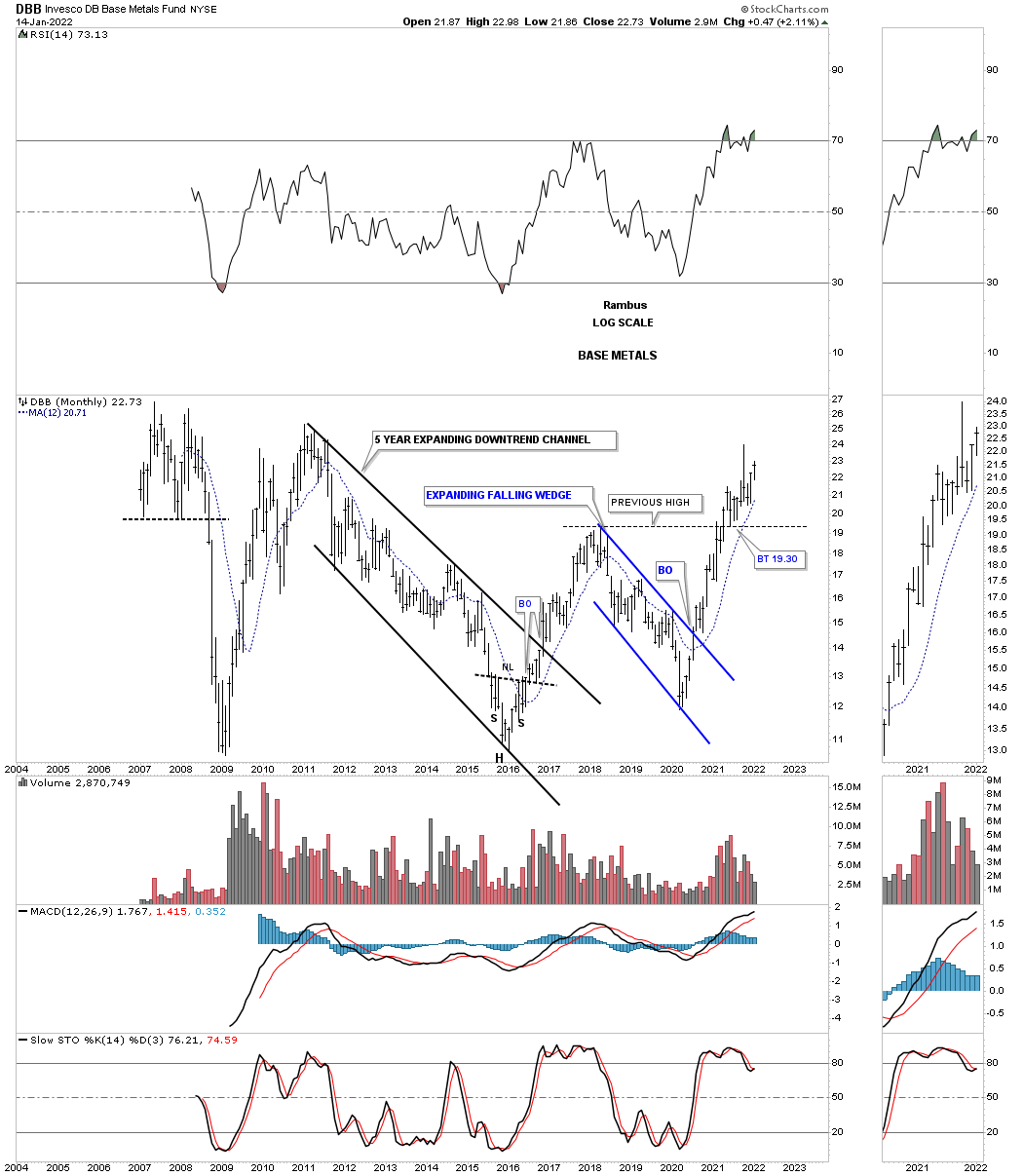
The DBB, base metals index, has enjoyed a nice impulse move out of its 2020 low which was actually a bit higher than the late 2015 low. In a strong bull market you want to see higher highs and higher lows which happened in early 2021. What was resistance now should turn into support when backtested from above which has already happened.
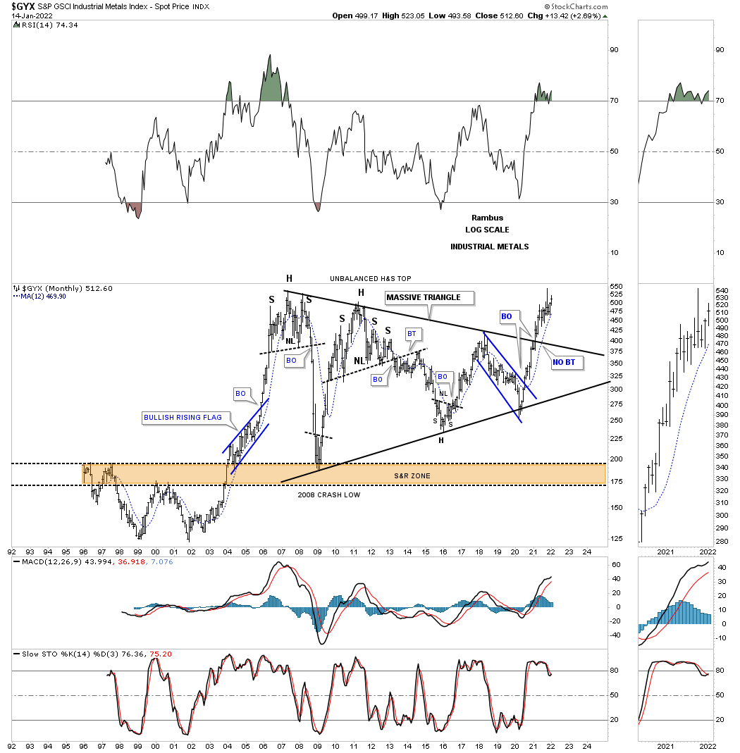
Next is the GYX, industrial metals index, which broke out from its massive triangle consolidation pattern and didn’t have a backtest to the top rail. Note the recent spike high which hit the all time high made back in 2007 and has sold off a bit. This is generally what happens before an old all time high is taken out. The price action is building up the energy to finally move into new all time high territory.
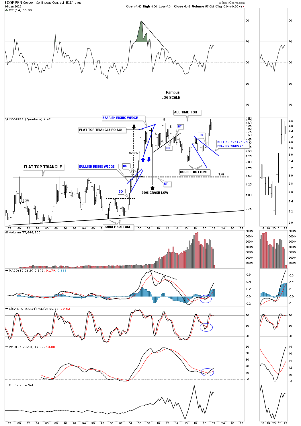
This long term monthly chart for Copper shows it was one of the first to breakout from its 2011 triangle consolidation pattern. Again, note how Copper has been consolidating since reaching its all time highs building up the energy it needs to move much higher. Copper also built the multi year double bottom that formed in the late 1990’s and early 2000’s that launched its secular bull market.
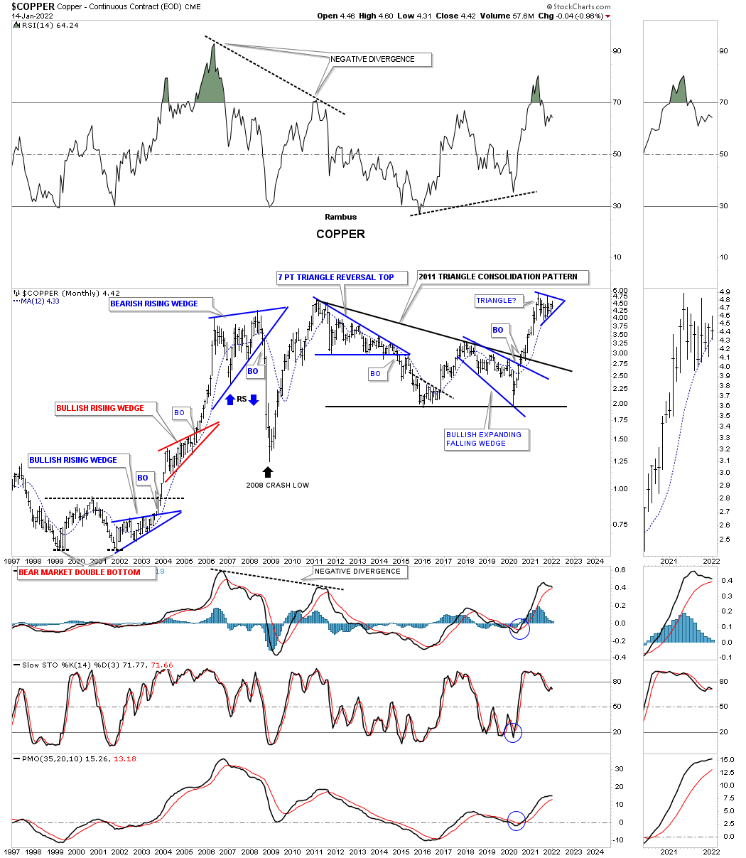
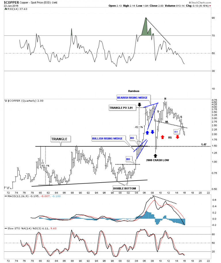
Here is the description of Copper I made back on June 22, 2016.
The 40-year quarterly chart for Copper shows its massive H&S top. Note how the crash in 2008 found support at the old highs around the 150 area. It sure looks like copper wants to reverse symmetry down to the top of the 20-year black triangle. The blue bullish rising wedge that formed during the bull market years formed right on the top rail of that 20-year flat top triangle. It took the energy of that blue bullish rising wedge to finally break through resistance which led to the impulse move price objective up to 3.81.
Copper 2022:
Copper ended up forming a double bottom just above the top rail of its multi year flat top triangle and is now testing its all time highs.
ENERGY:
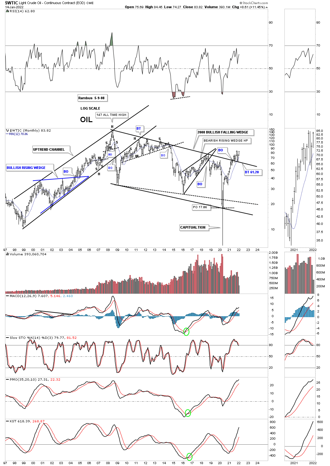
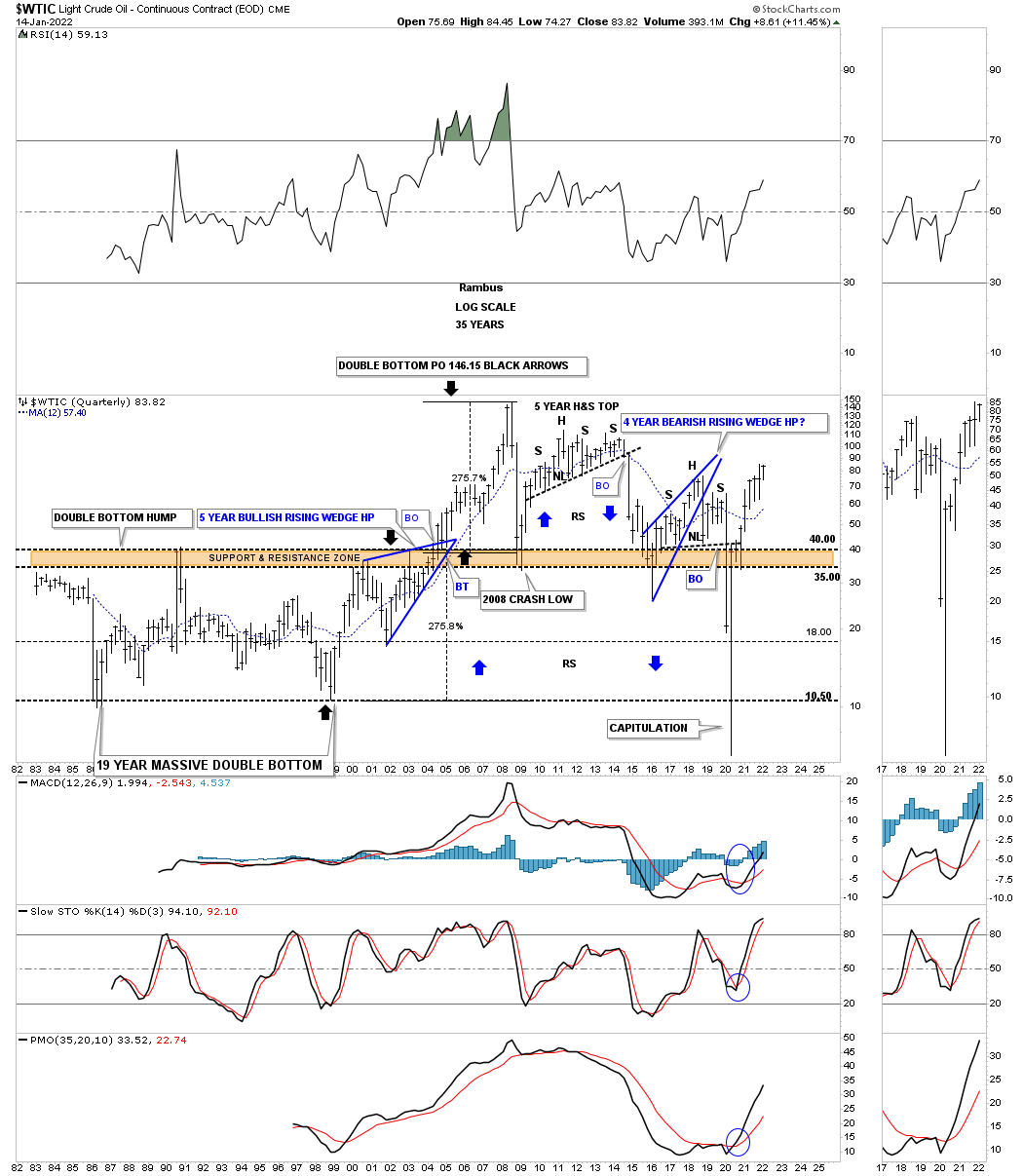
The WTIC, Crude Oil, has been one of the strongest areas in the energy complex of late. It is currently in the breaking out and backtesting mode to the top rail of its 2008 bullish falling wedge. This long term monthly chart also shows you its bull market rally that took WTIC to its all time high made at 147 in 2008.
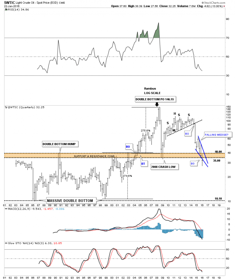
WTIC June 22, 2016 Quarterly chart:
Below is a very long-term 35 year chart for oil which shows its huge trading range that lasted from the early 1980’s to the early 2000’s when it finally broke above that massive resistance zone between 35 and 40. Once it broke above that brown shaded S&R zone there was nothing to stop the price action from skyrocketing up to 147 where it finally ran out of gas. What is interesting about this long-term chart for oil is the trading range between 10 and 40. What that massive trading range measured out to was 146.15 on a percentage basis which was around 275%. You can see how our blue falling wedge has cracked below the upper brown shaded support and resistance zone. The pieces of the puzzle are all there we just have to see the price action do its thing now and move lower.
WTIC 2022:
Below is the current quarterly chart for WTIC which shows its massive reverse symmetry move all the way down to its all time lows and then reversing right back up over that same area.
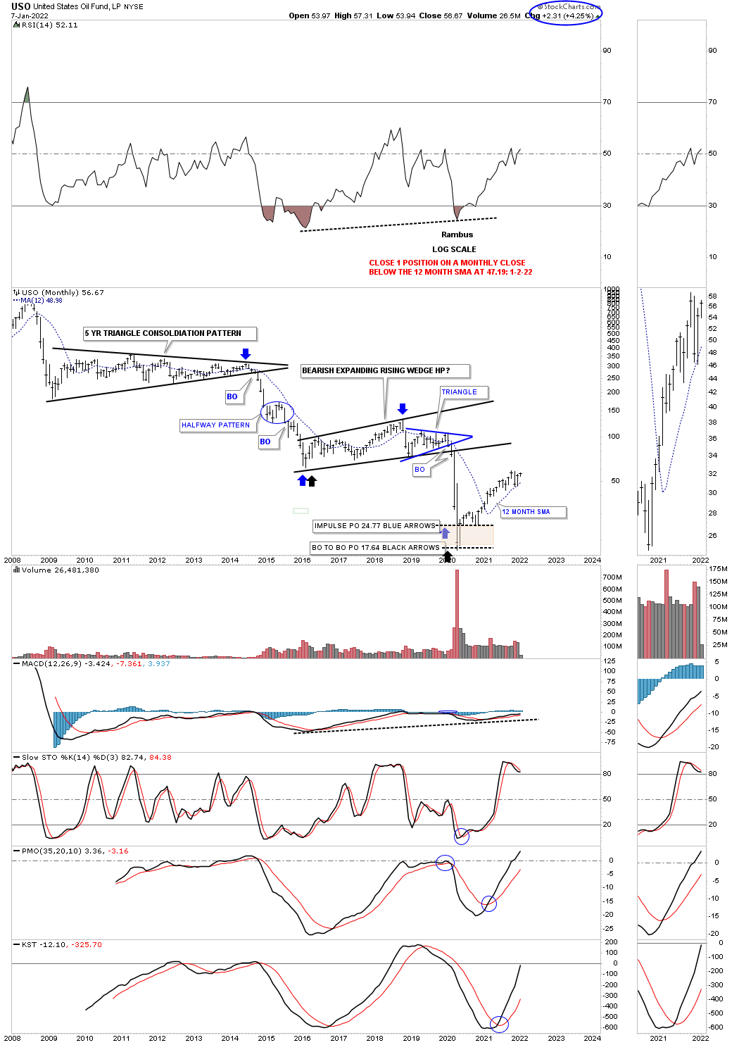
After reaching its two different price objectives, brown shaded area, the USO, US oil fund has been steadily moving higher finding support on its 12 month sma.
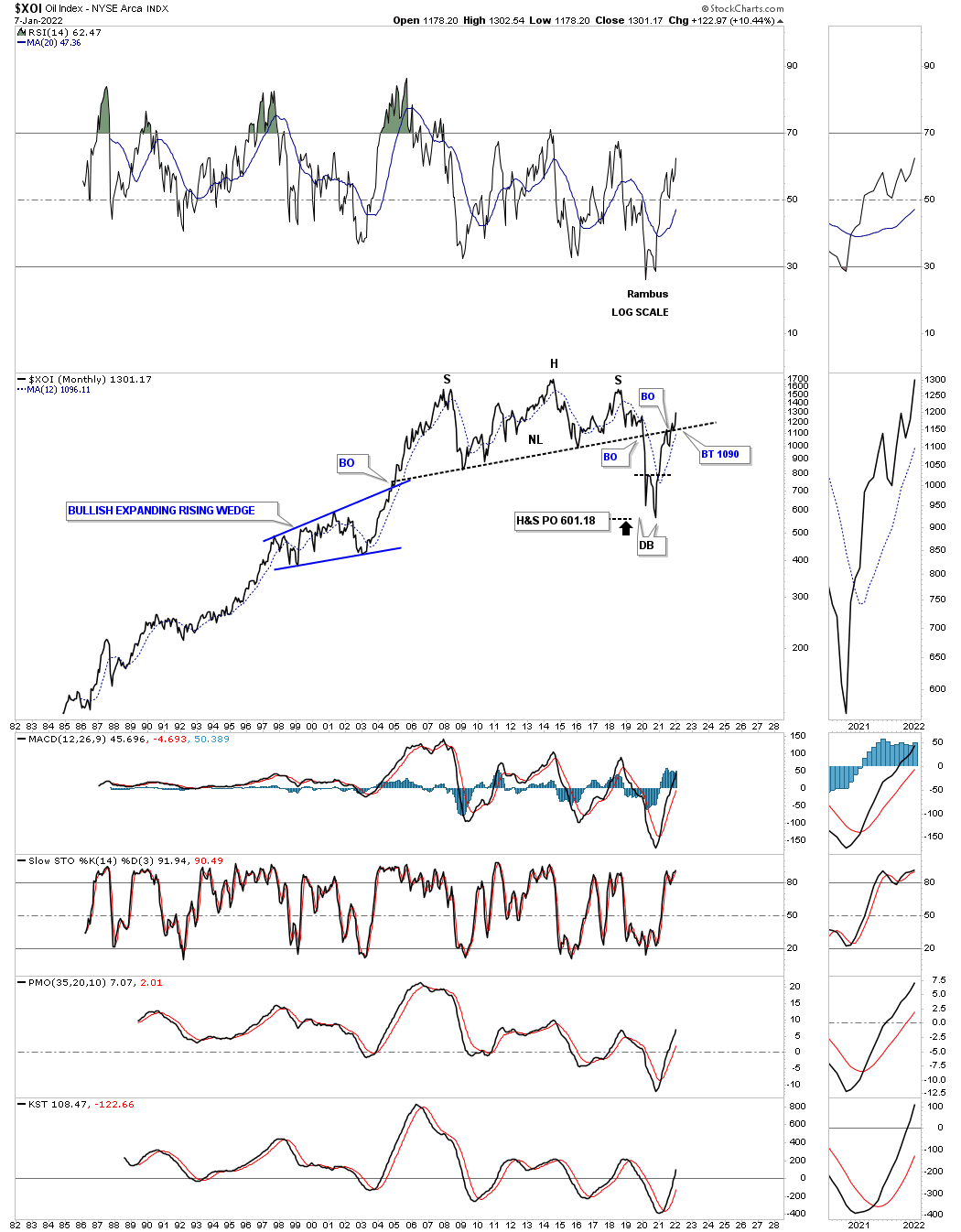
The XOI is another oil index which reached its H&S price objective and formed a double bottom reversal pattern. The price action is currently trading back above its neckline which is a very bullish development.
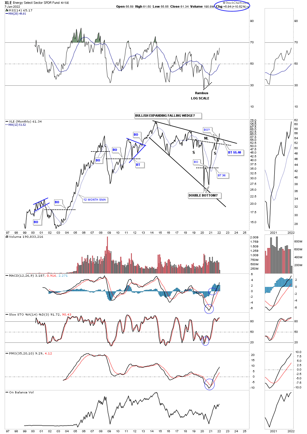
The XLE is an energy stock fund that is just now starting to breakout from a very large bullish expanding falling wedge. Note the double bottom made at the recent low which is the head of a much bigger H&S reversal pattern. Two very bullish patterns in one.
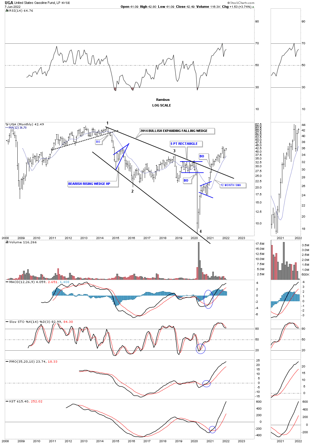
UGA is the US gasoline fund which is a step ahead of the XLE as it has already moved higher after breaking out from is massive bullish expanding falling wedge.
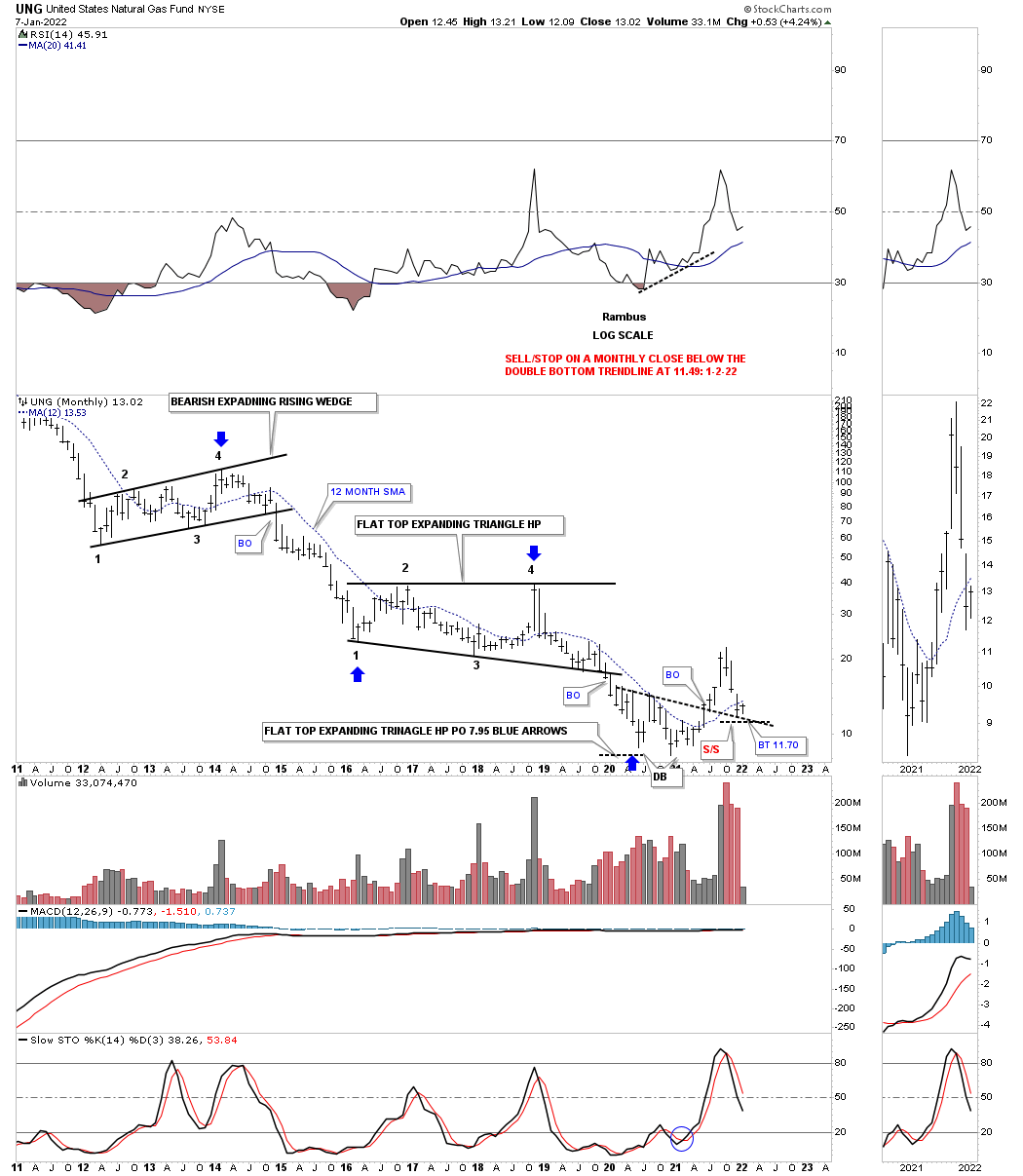
Below is the UNG, Natural Gas fund, which has been the weakest areas within the energy complex. After putting in a double bottom at the most recent lows it is now in the process of backtesting the double bottom trendline around the 11.70 area.
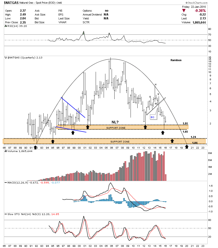
NATURAL GAS June 22, 2016.
This last chart for Natural Gas is a 30-year quarterly chart which shows the entire history. It has some unbelievable symmetry as shown by the rounding top formation. There are two major support zones as shown by the brown shaded areas. I’ve added three black arrows on the left side of the chart pointing up and three black arrows on the right side of the chart showing possible reverse symmetry support. In 2012 natural gas came down to the top of the upper brown shaded support zone and had a decent rally back up. Then last quarter, the end of 2015, natural gas came back down testing the lower part of the brown shaded support zone and got a bounce. Basically what it’s doing is eating away the support zone. I expect the next decline may very well break below the upper brown shaded support zone and decline down to the top of the lower support zone where we may see a good bounce. At any rate Natural Gas has created a very pretty long-term chart.
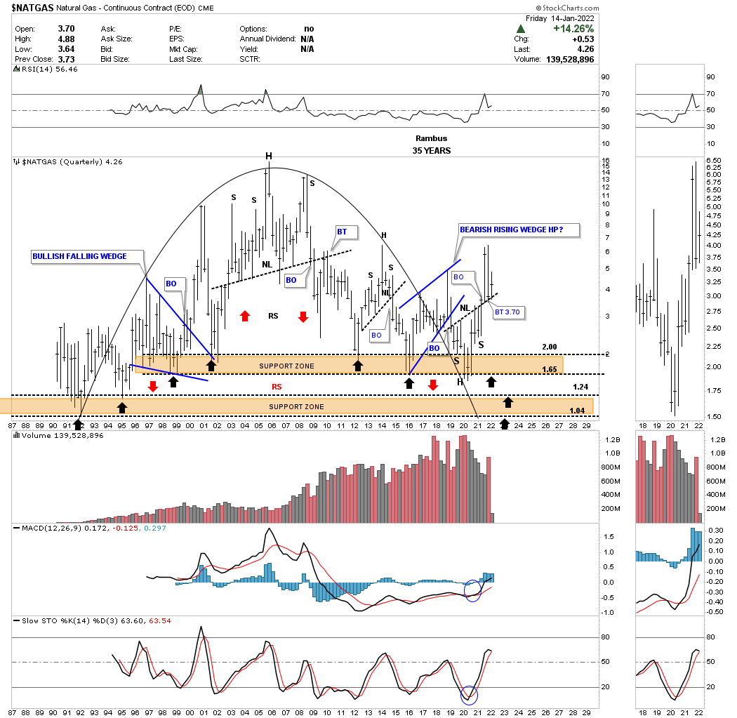
NATURAL GAS 2022:
Natural Gas never made it all the way down to the lower brown shaded S&R zone but instead formed the head portion of the 2020 inverse H&S bottom which had a massive breakout rally and is now backtesting the neckline.
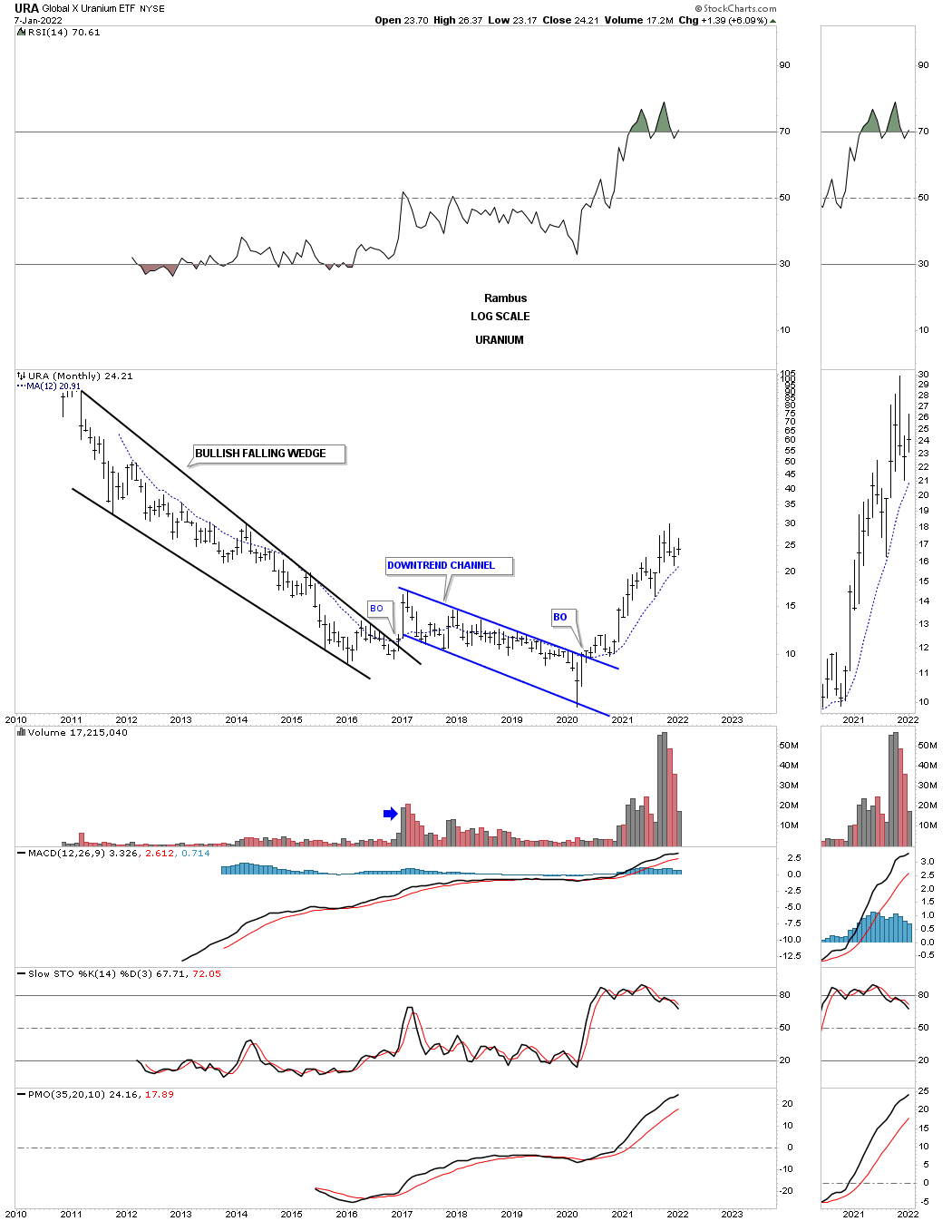
After spending most of its lifetime trending down the URA uranium etf, has been in the biggest rally of its existence.
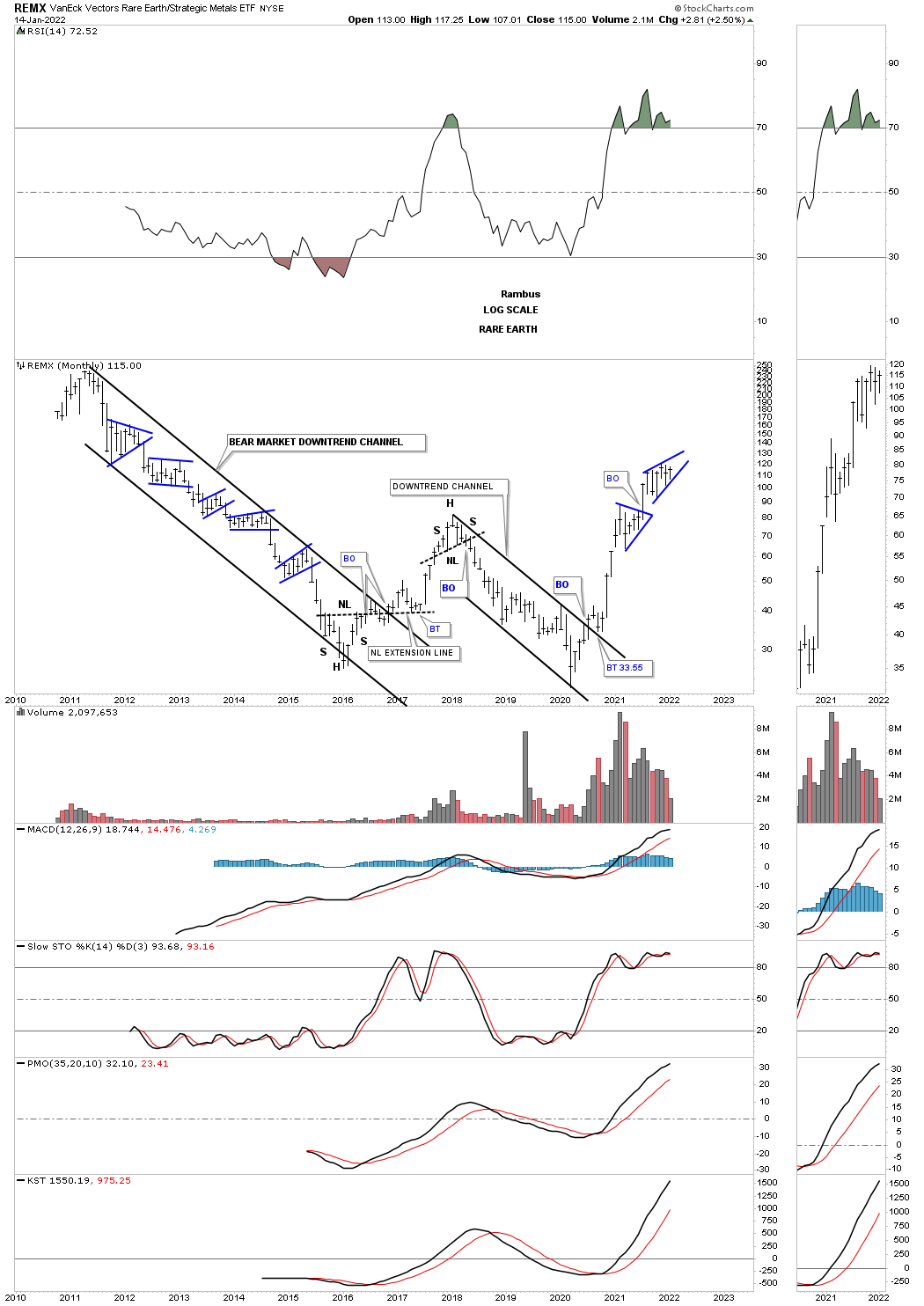
After breaking out from its 2018 downtrend channel the REMX, Rare Earth etf, is currently enjoying the biggest rally of its history.
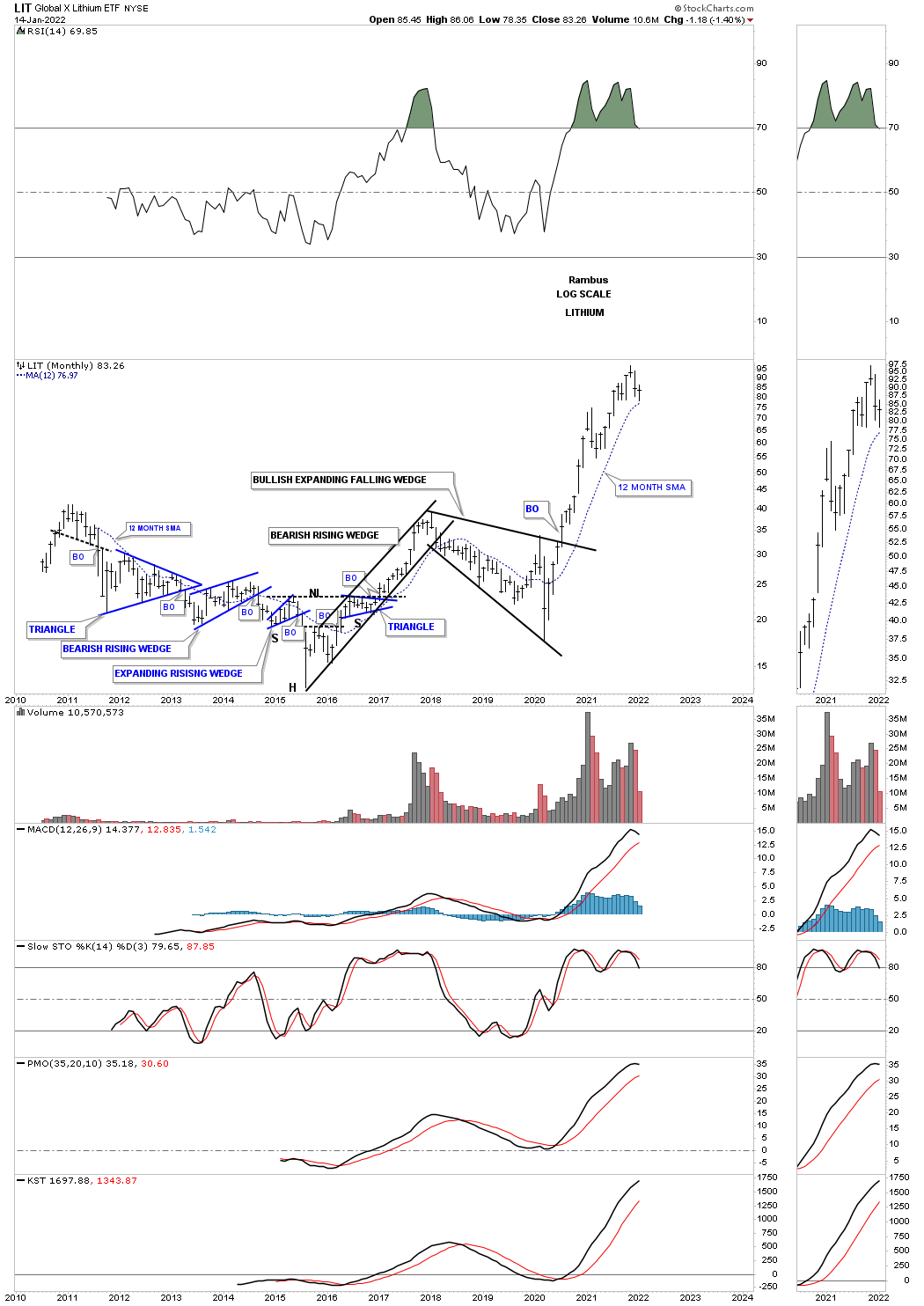
After breaking out from its 2018 bullish expanding falling wedge the LIT lithium etf, hasn’t looked back.
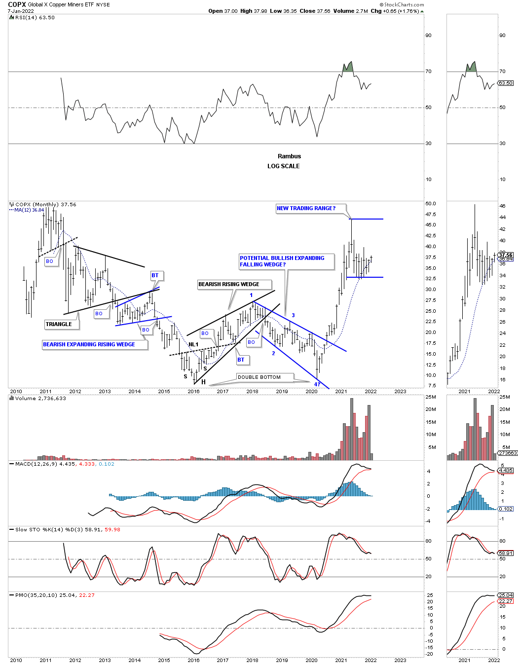
The COPX, Copper miners etf, has had a massive rally after breaking out from its bullish expanding falling wedge which was the right side low of a large double bottom. After almost reaching its all time high it was time to consolidate those gains which it is currently doing, forming a new trading range.
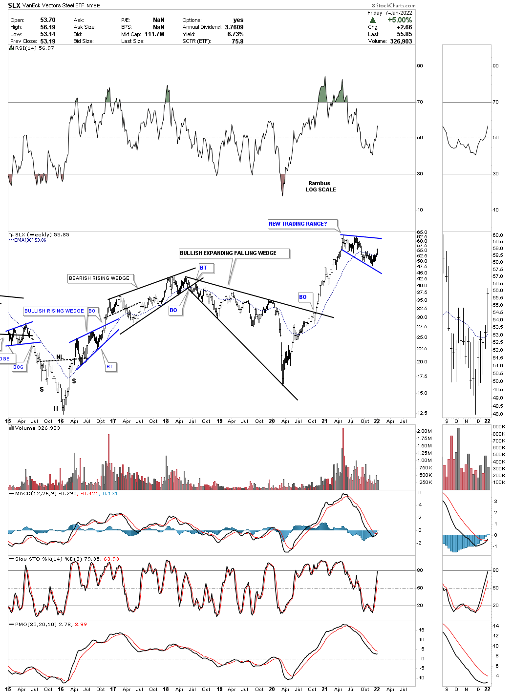
SLX is a steel etf which had a massive rally after breaking out form its 2018 bullish expanding falling wedge. After such a large move its been consolidating those gains for close to a year now. Forming consolidation patterns during a bull market is the best way to keep the bull market healthy. When a bull market starts to go parabolic is when you know the end is coming.
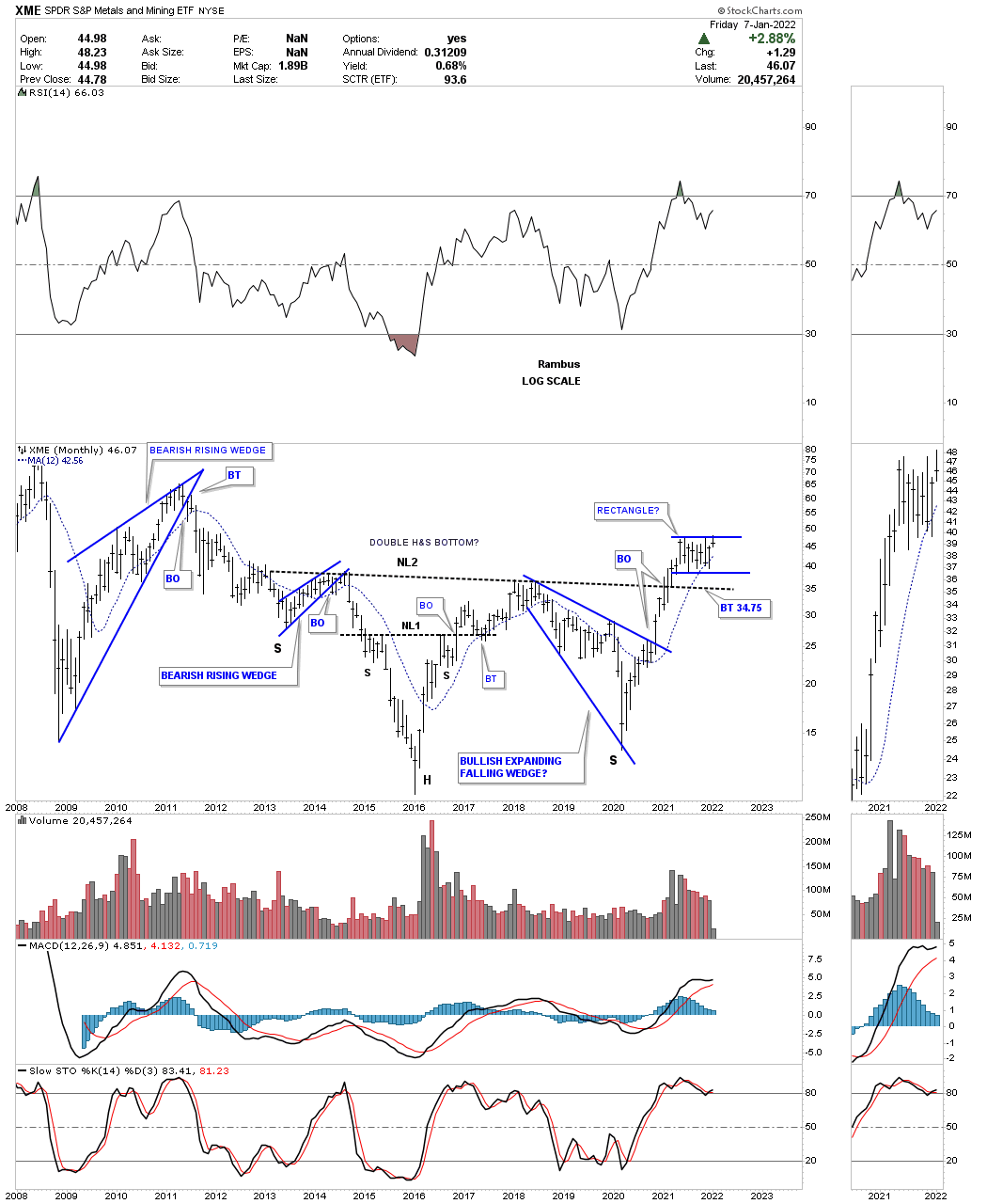
The XME, metals and miners etf, also shows a strong rally after breaking out from its own 2018 bullish expanding falling wedge. It too has been consolidating those gains for close to a year now.
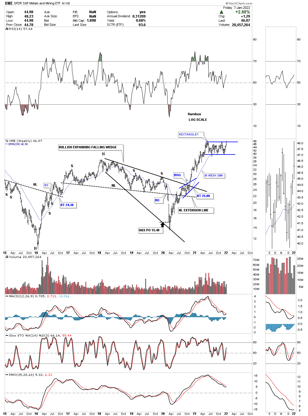
This long term monthly chart for the XME shows the current trading range forming above the very large H&S bottom neckline.
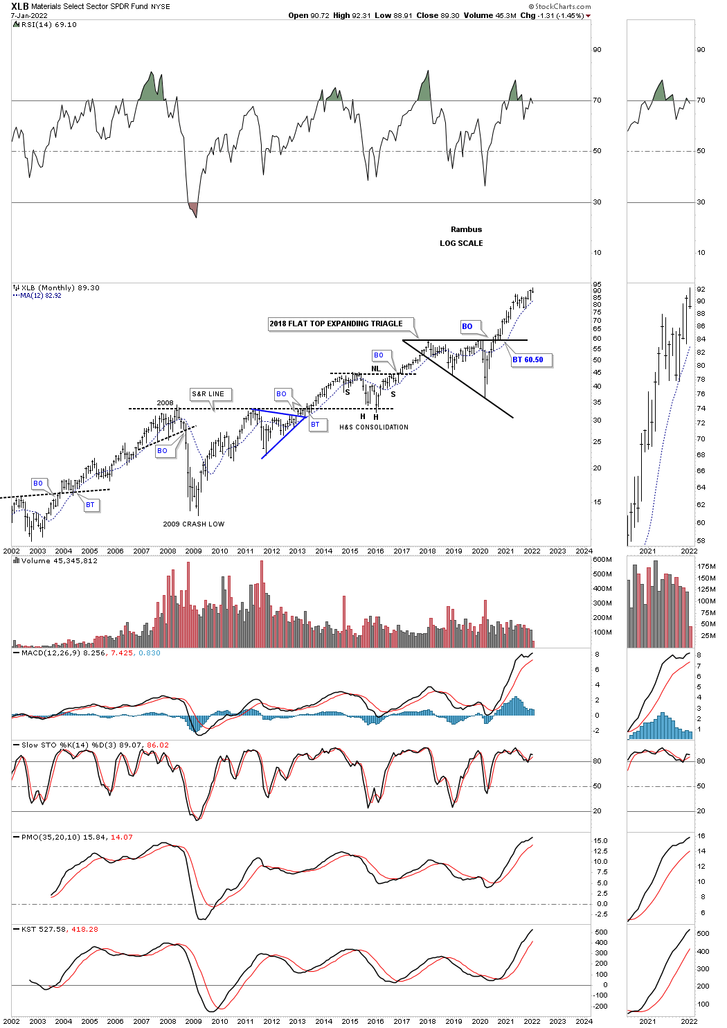
This long term monthly chart for the XLB, basic materials fund, shows its impulse move out of its 2013 flat top expanding triangle.
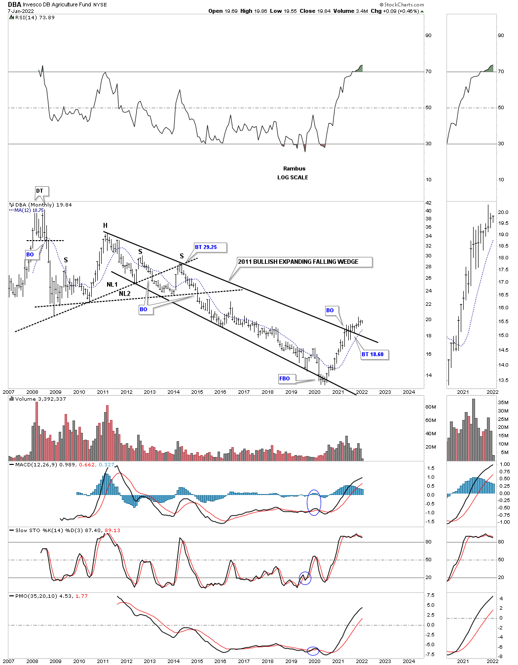
The DBA, Agriculture fund, has been the weakest area in the commodities complex but is starting to come to life after breaking out from its 2011 bullish expanding falling wedge.
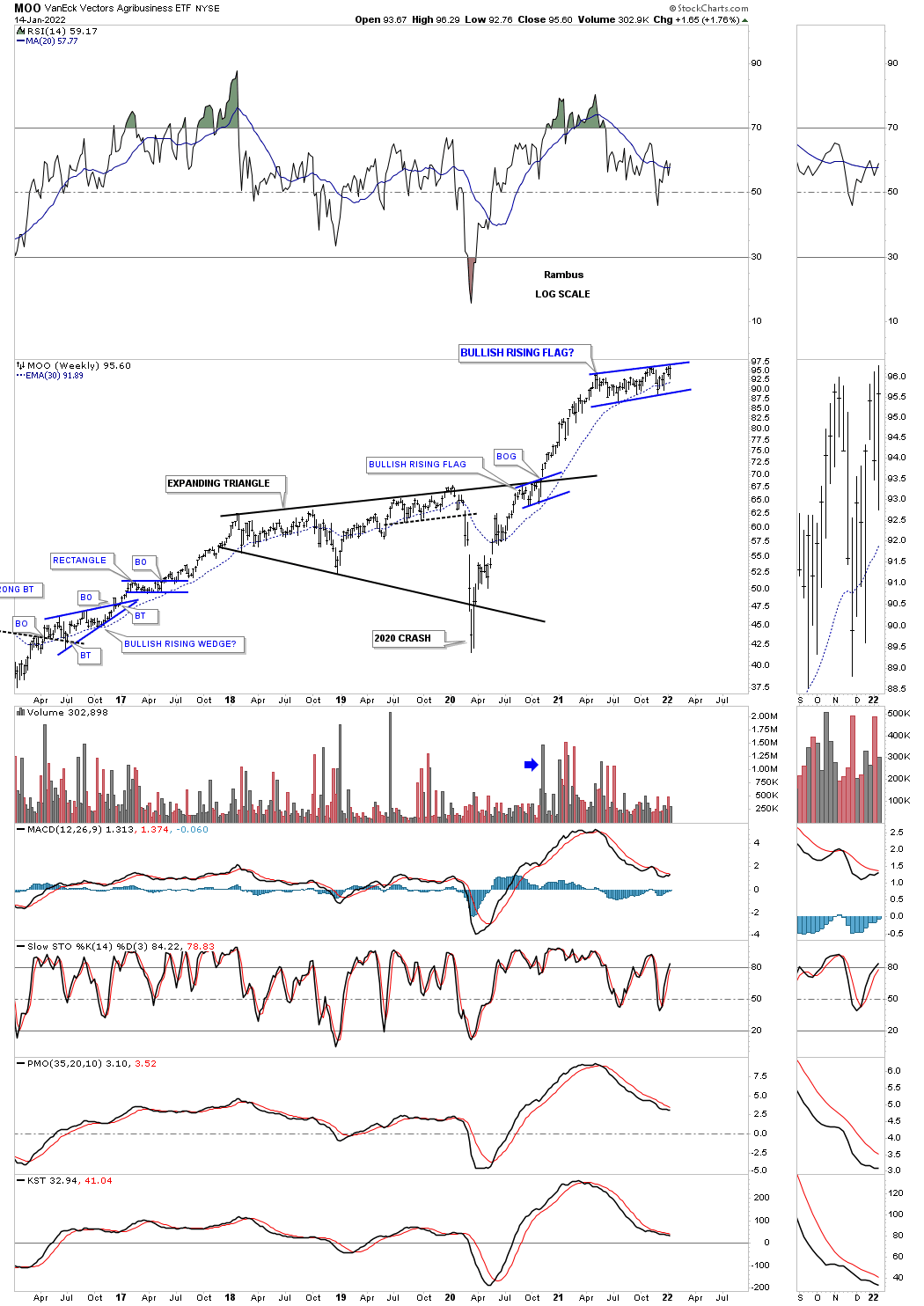
MOO is another Agriculture etf which looks completely different from the DBA. After breaking out from its multi year black expanding triangle it has been consolidating those gains for the last year.
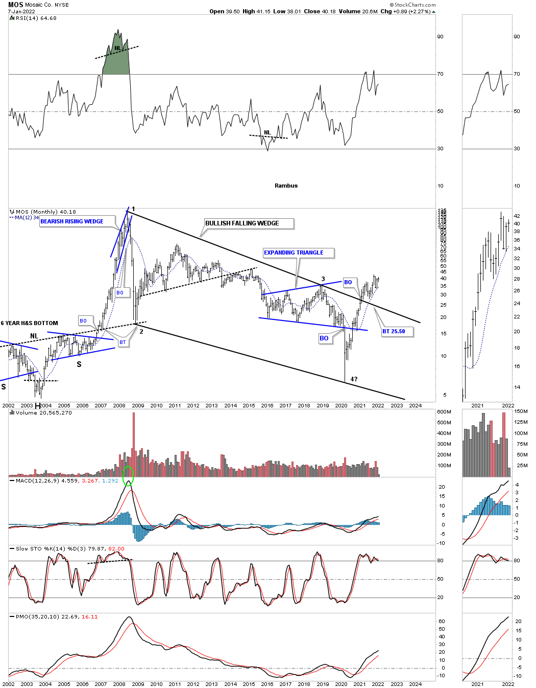
MOS is a potash stock that has recently broken out from its massive bullish falling wedge with a backtest to the top rail in place.
Precious Metals:
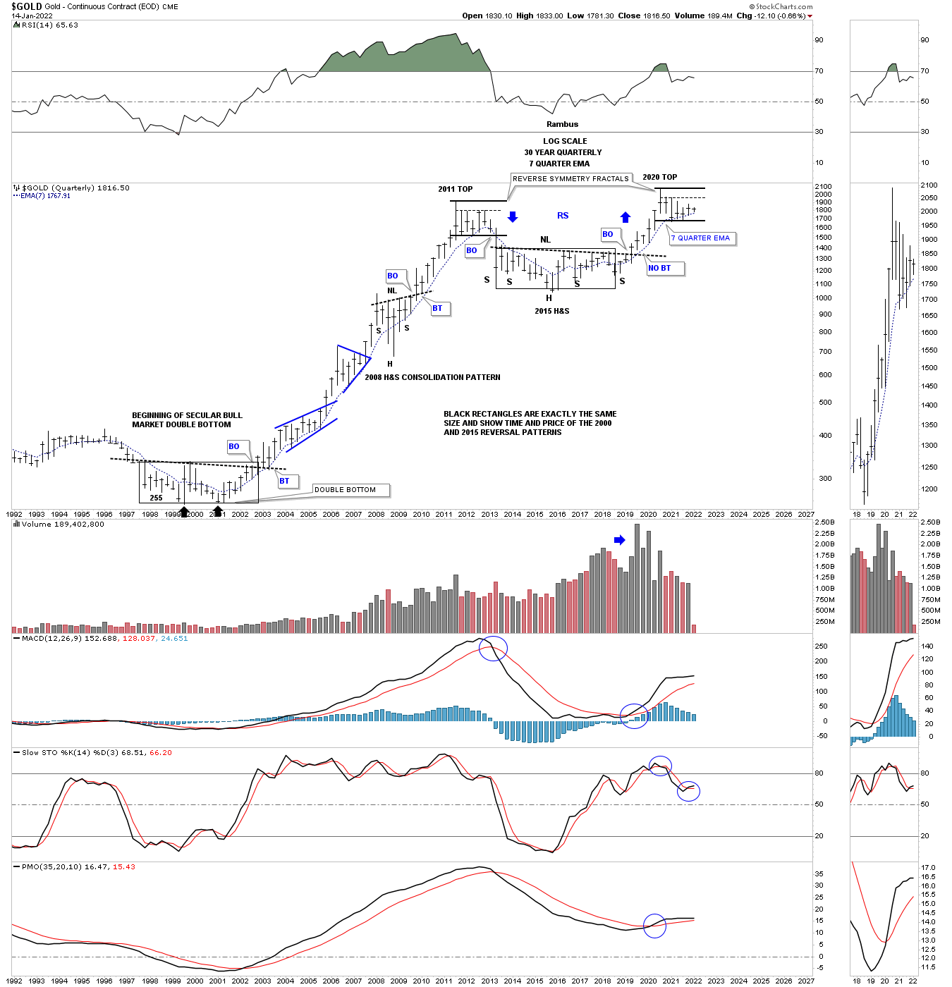
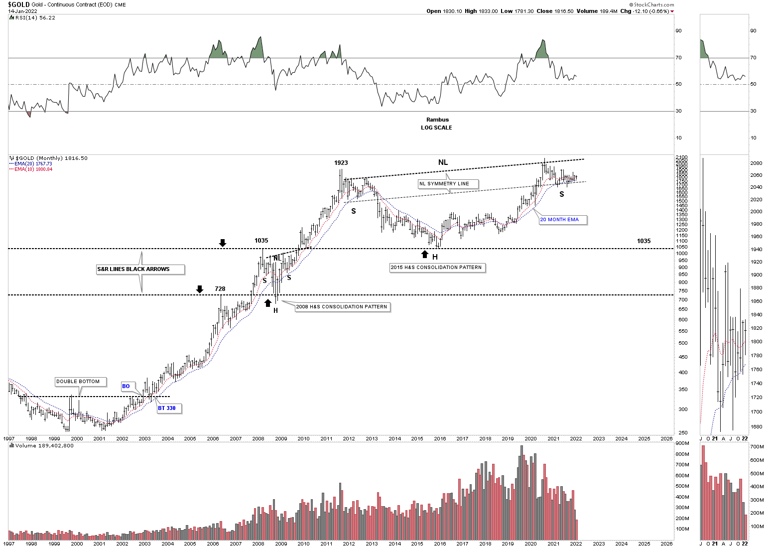
We’ve been following this long term quarterly chart for Gold looking at the fractal nature of the 2000 bear market low and the 2015 H&S consolidation pattern. The two black rectangles, one at the 2000 low and the 2nd one forming the 2015 H&S consolidation pattern are exactly the same height and length which measure time and price. If the 2000 rectangle launched Gold on an eleven year bull market then there is no reason why the 2015 H&S consolation pattern which is the same in time and price shouldn’t lead to the next leg up in Gold’s secular bull market.
There is another important aspect of this chart which is the reverse symmetry fractals. Note how similar the 2011 trading range is compared to our current 2020 trading range. Price wise they are exactly the same height but time wise the 2020 trading range should complete in March of this year.
During the 2000 to 2011 bull market the 20 month ema did an outstanding job of holding support except for the 2008 crash. As you can see it is also showing support so far since the breakout from the 2015 H&S neckline. Will it continue?
Below is just a simple chart for Gold that goes back to the bear market low in 2000 and the secular bull market that followed. As you can see there is a possible massive H&S consolidation pattern that is forming with the right shoulder low still holding support on the neckline symmetry line. The black dashed horizontal lines are support and resistance lines which formed at critical points during the bull market years. Once resistance is broken it should reverse its role to support on a test from above as shown by the black arrows.
This long term weekly chart for Silver shows it too is forming a possible very large H&S consolidation pattern. So far at the neckline symmetry line has been holding the low for the right shoulder. The neckline symmetry line shows us an area where to look for a right shoulder low which many times can be spot on and other times it can be off somewhat. But it is the general area we want to focus on which in this case is still working.
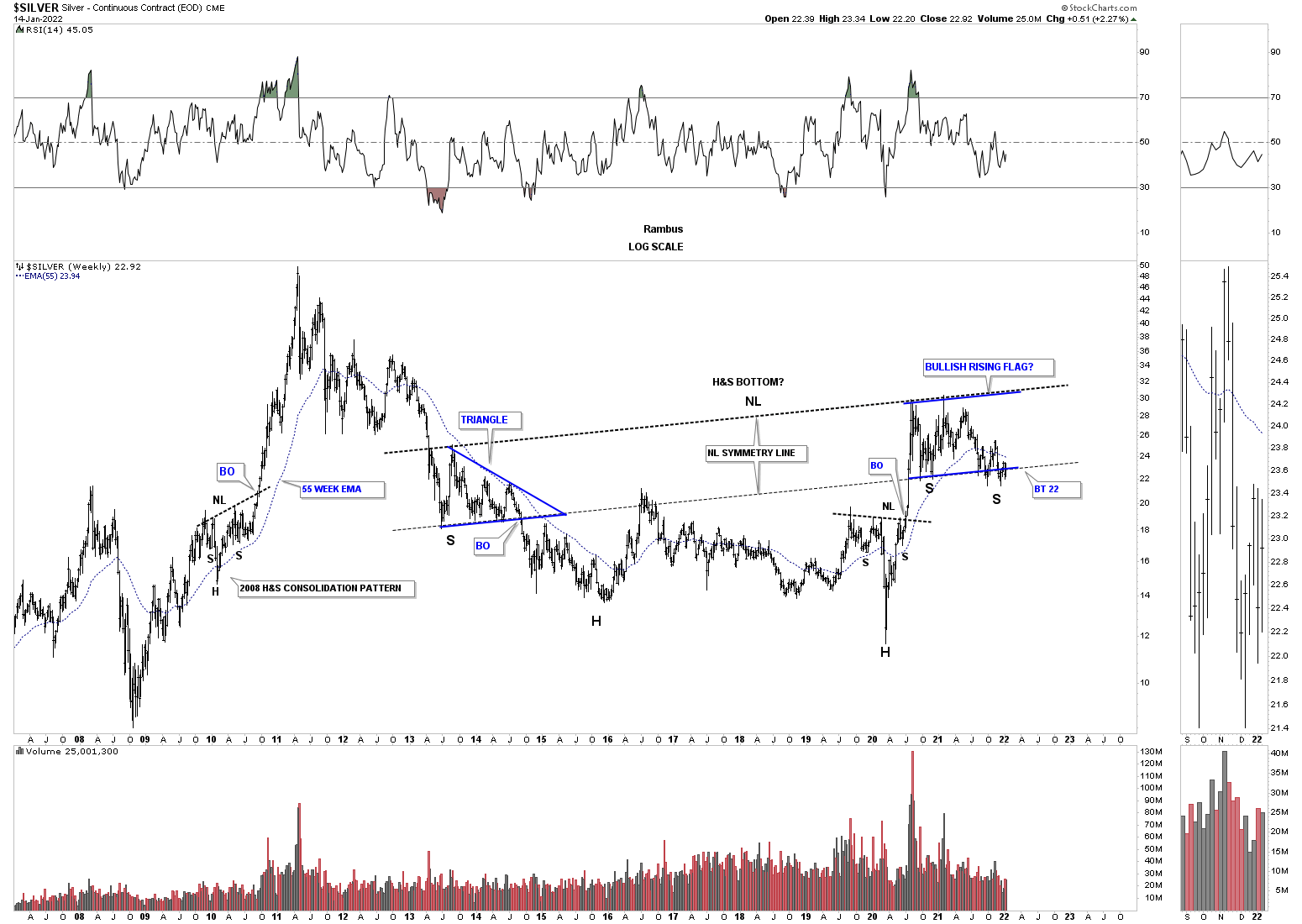
Compared to most of the different commodes charts we looked at above the PM complex has been more in a consolidation mode than an impulse move.
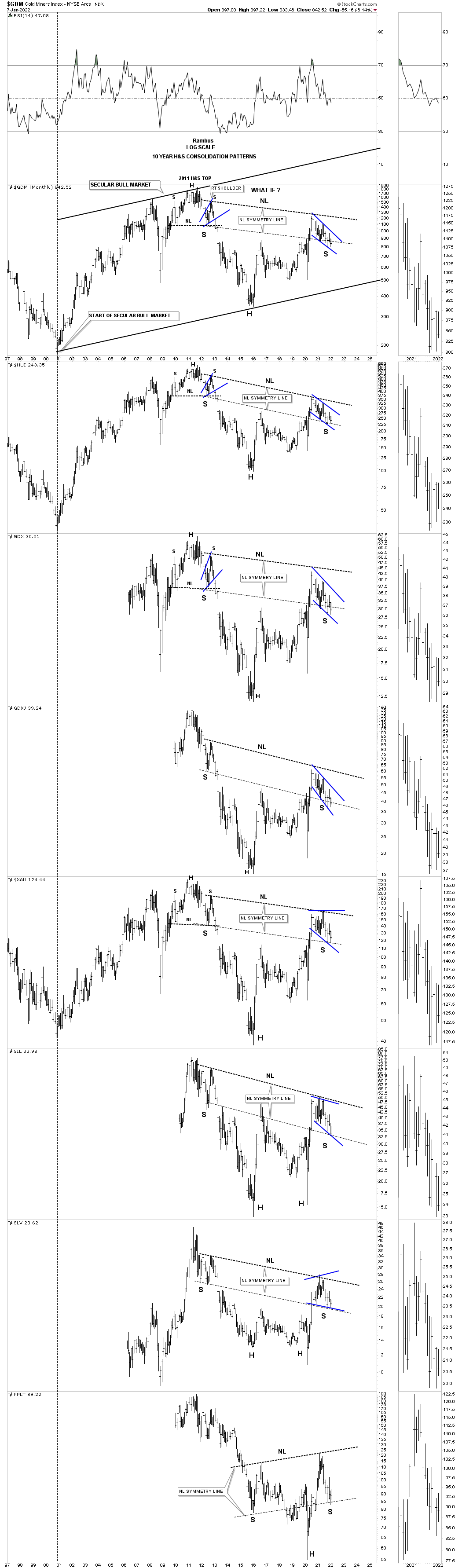
This last chart is a long term monthly combo chart which has most of the important precious metals stock indexes on it. So far the precious metals complex hasn’t had its turn in the commodity bull market yet but could be forming a massive H&S consolidation pattern with the possible right shoulder low under construction, as shown by the neckline symmetry line.
I know I sound like a broken record when I keep saying, big patterns lead to big moves, but that is the fractal nature of the markets. Commodities in generally bottomed in the spring of 2020 which ended their nearly 12 year bear market in many cases. A long term bear market is followed by a long term bull market. Understanding the big picture will help you navigate the twist and turns the markets throw at us each and everyday. All the best…Rambus
US and World Stock Markets
So far, in regards to the US stock markets I don’t see any yellow warning flags yet just some chopping action for the most part. There has been some strong rotation from some of the stronger sectors that led the markets out of the March 2020 crash low to some of the lagging sectors. This is usually a healthy development in the long term.
I realize that many investors are bearish on the stock markets and that is understandable since our current secular bull market began in 2009. How can the stock markets keep going up? It is called the wall of worry. Bull markets are punctuated with selloffs from time to time that is needed to work off overbought conditions and to keep investors wondering if this time the bear market is really going to start.
I’m not going to go into great detail as we’ve been following these long term charts for many years. We’ll start with the US stock markets and then look at some of the world stock markets as they all tend to move together to a certain degree.
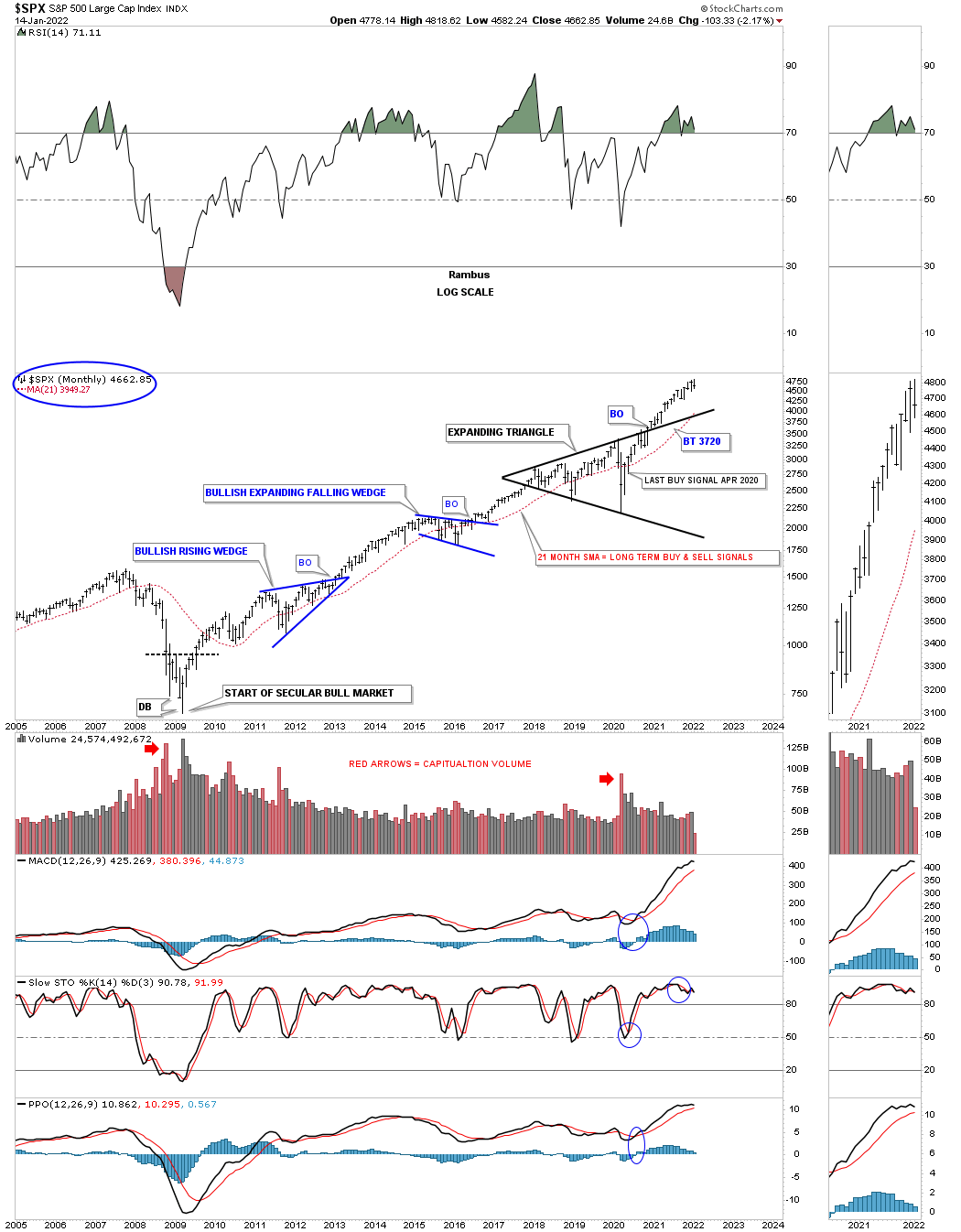
Let’s start with the SPX as it is the most important stock market in the world. This shorter term monthly chart shows the 13 year flat top expanding triangle that launched the SPX on its current secular bull market beginning at the 2009 crash low.
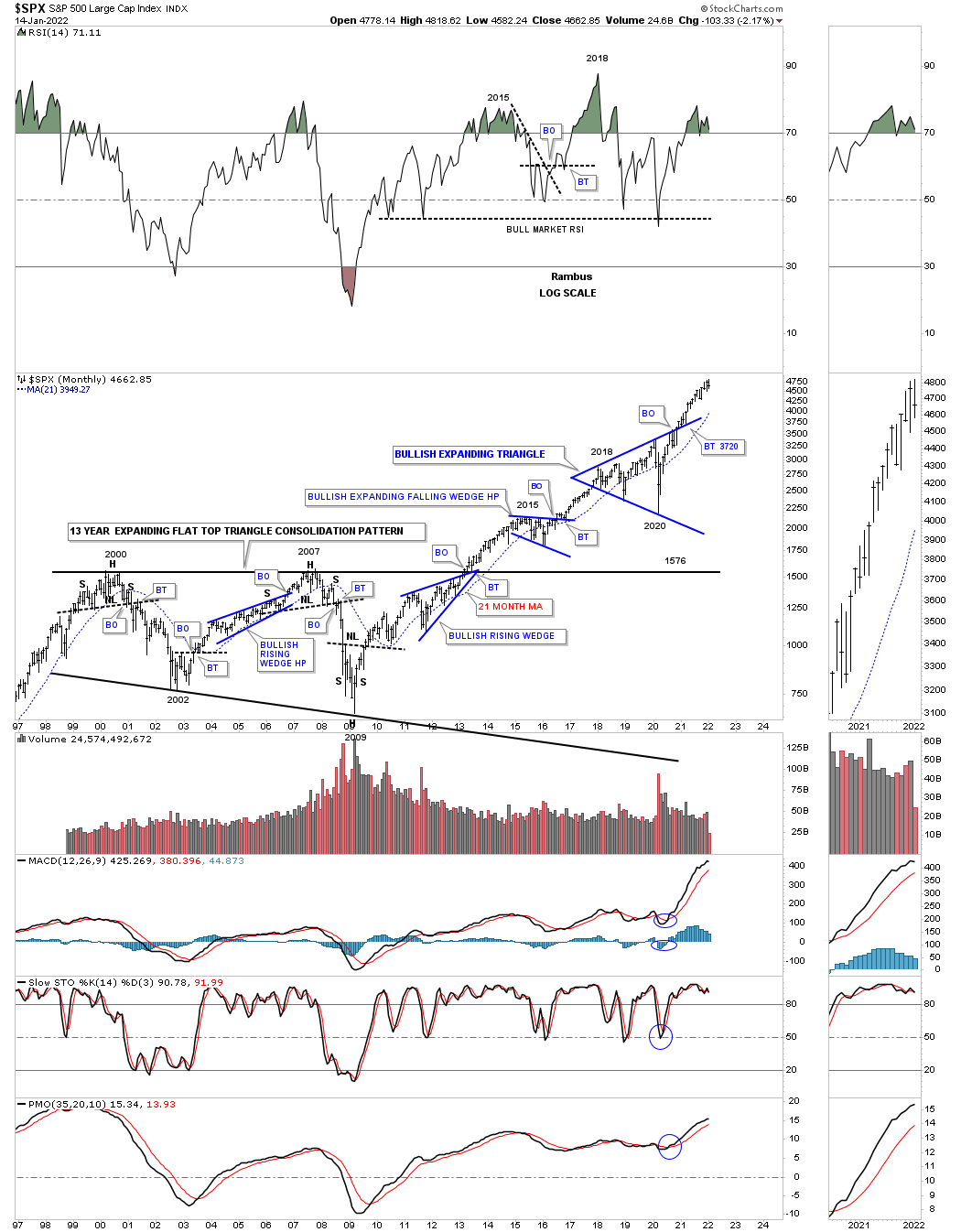
This next chart is a long term quarterly chart for the SPX which shows the secular bull market that took place at the 4th reversal point in 1982 which ran hard into the 2000 all time high at reveal point #1 in the 13 year flat top expanding triangle. That 13 year flat top expanding triangle consolidation pattern was needed to correct the pervious secular bull market. Our current secular bull market began at the 4th reversal point at the 2009 crash low at reversal point # four.
This long term 75 year quarterly chart also shows the similarities between the 1987 crash low to the recent 2020 crash low as shown by the light blue shaded areas. Compare the 1987 crash low to the 2020 crash low which gives you an idea of where our current secular bull market is compared to the 1987 crash low and the rally that followed. The SPX rallied for another 13 years before finally topping out in 2000. The SPX has only rallied about a year and a half since the 2020 crash low so if history is any guide, as it has been since the 2009 low, then this secular bull market still has a long ways to go yet before we see any type of significant top, correction yes but no significant bear market.
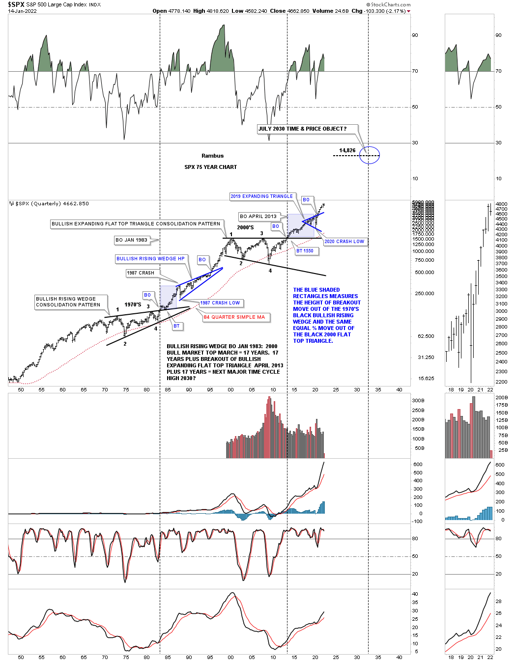
SPX 21 month sma for long term buy and sell signals. A monthly close above the 21 month sma is a buy signal and a close below the 21 months sma is a sell signal. The last long term buy signal was given one month after the March 2020 crash low and is still on a long term buy signal until the SPX closes a month below it.
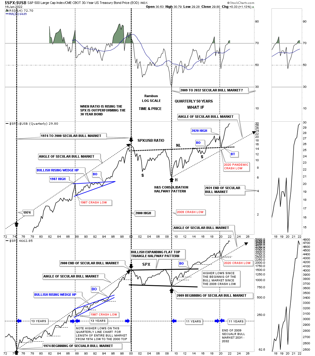
This next chart is a long term quarterly ratio combo ratio chart which compares the $SPX:$USB ratio on top to the SPX on the bottom. As you can see the ratio chart on top is confirming the secular bull markets, the 1974 to 2000 secular bull market and our current secular bull market that began at the 2009 crash low. Note the massive H&S consolidation pattern that formed on the ratio chart which you can compare to the 2013 flat top expanding triangle on the SPX. Since the 2020 crash low both have been making new all time highs which is what you would expect if the secular bull market is alive and well. There is a lot of other important information on this ratio combo chart if you take a few minutes to study the information in more detail.
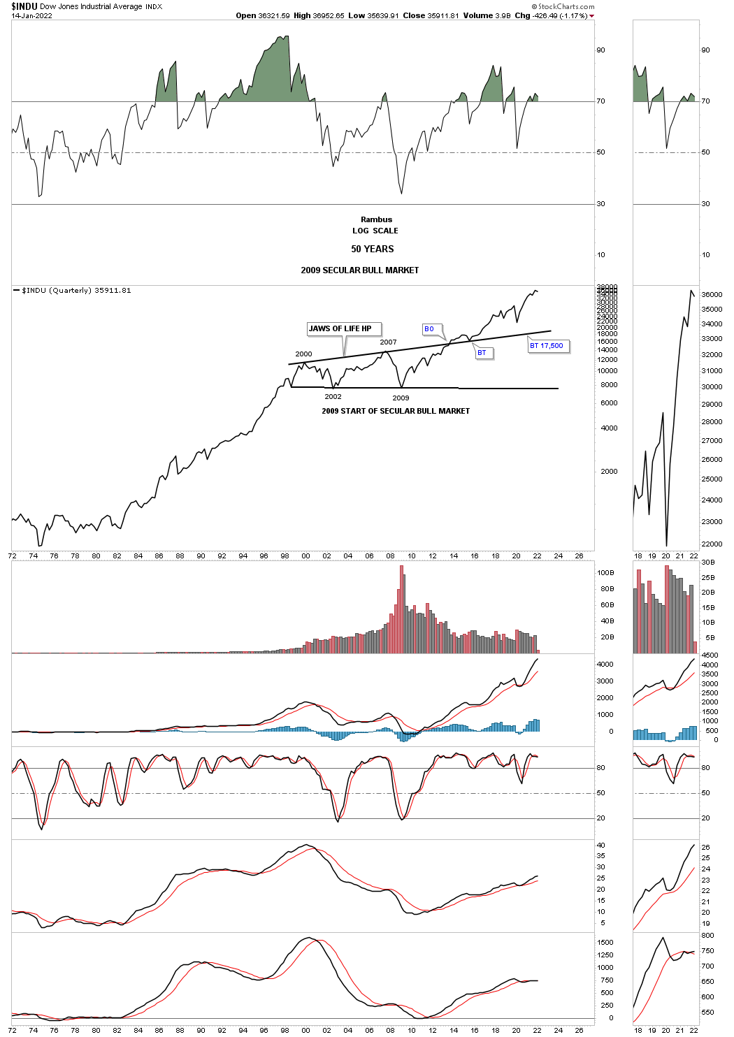
Next is the 75 year quarterly chart for the INDU which shows its 1974 to 2000 secular bull market and our current secular bull market that began in 2009. This chart shows the beautiful massive H&S consolidation pattern that consolidated the previous secular bull market that ended at the beginning of the massive H&S consolidation pattern. Here again you can see the 1987 crash low compared to the 2020 crash low. At the beginning of 2000 started the 13 year expanding triangle consolidation pattern I called the JAWS OF LIFE because I believed we are in a secular bull market. Others with a bearish view back then called it the JAWS OF DEATH, which was going to lead to the end of the world as we knew it.
Note how close the backtest was at the 2020 crash low to the top rail of the, JAWS OF LIFE. The 2020 low was the 4th reversal point in the smaller expanding triangle that I call the, BABY JAWS OF LIFE.
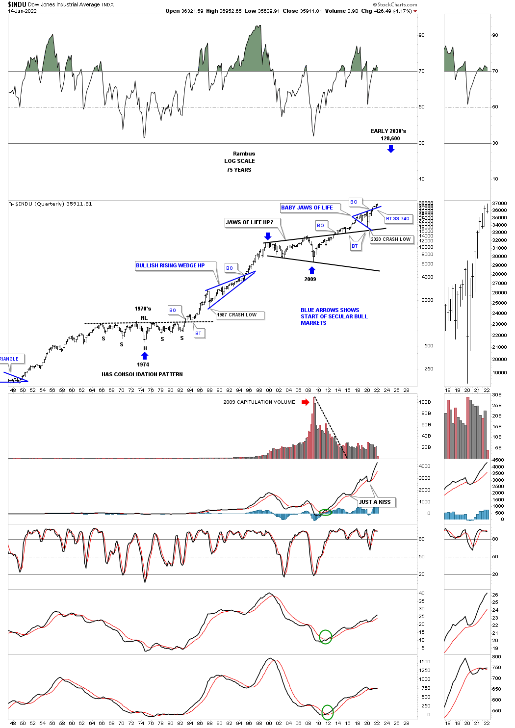
This quarterly line chart for the INDU shows you a good example of how the previous secular bull market looked, 1974 low to the 2000 top, compared to our current secular bull market that began in 2009. During the rally from 1974 to the 2000 top you can see on this quarterly line chart that the corrections were generally very shallow which is what I’m expecting in our current secular bull market and has been working out quite well so far.
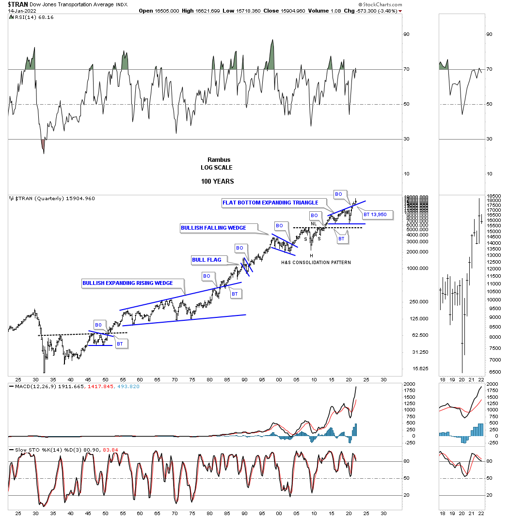
This monthly chart for the Transportation Average shows the price action backtesting the top rail of the massive 2013 flat bottom expanding triangle with the bullish expanding falling wedge forming just below the top rail which strongly suggested the top rail of the black flat bottom expanding triangle was going to give way. Looking at this 20 year chart you can see the Transportation Average has produced some very nice consolidation patterns starting with the very symmetrical H&S consolidation pattern where the head formed at the 2009 crash low.
This 100 year history chart for the Transportation Average puts the current 2013 flat bottom expanding triangle in perspective. Actually the 2013 flat bottom expanding triangle looks just about right compared to the other smaller consolidation patterns that formed over the last 100 years. It is also forming on top of the multi year H&S consolidation pattern neckline.
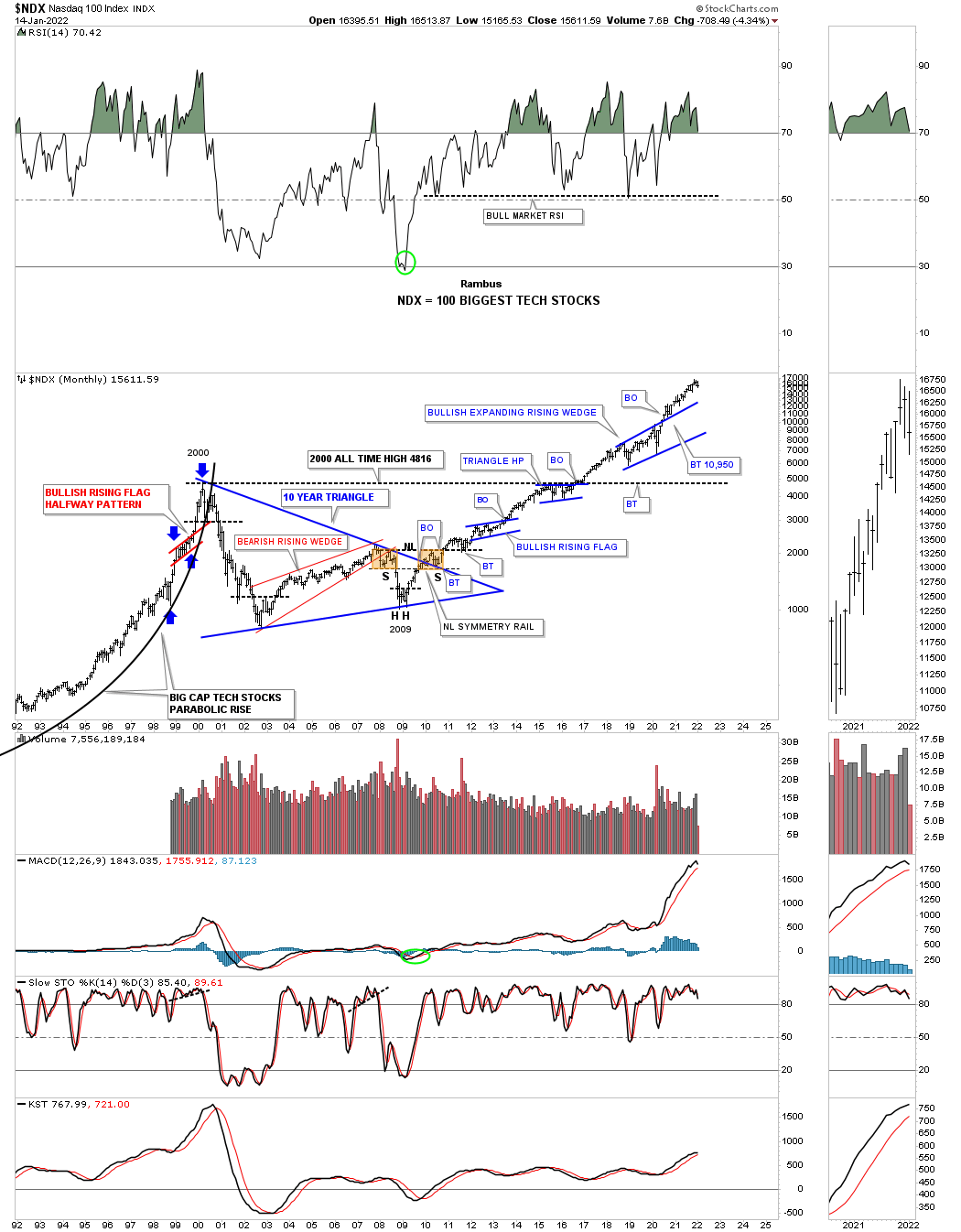
There is a lot of classic Chartology on this 30 year monthly chart for the NDX 100.
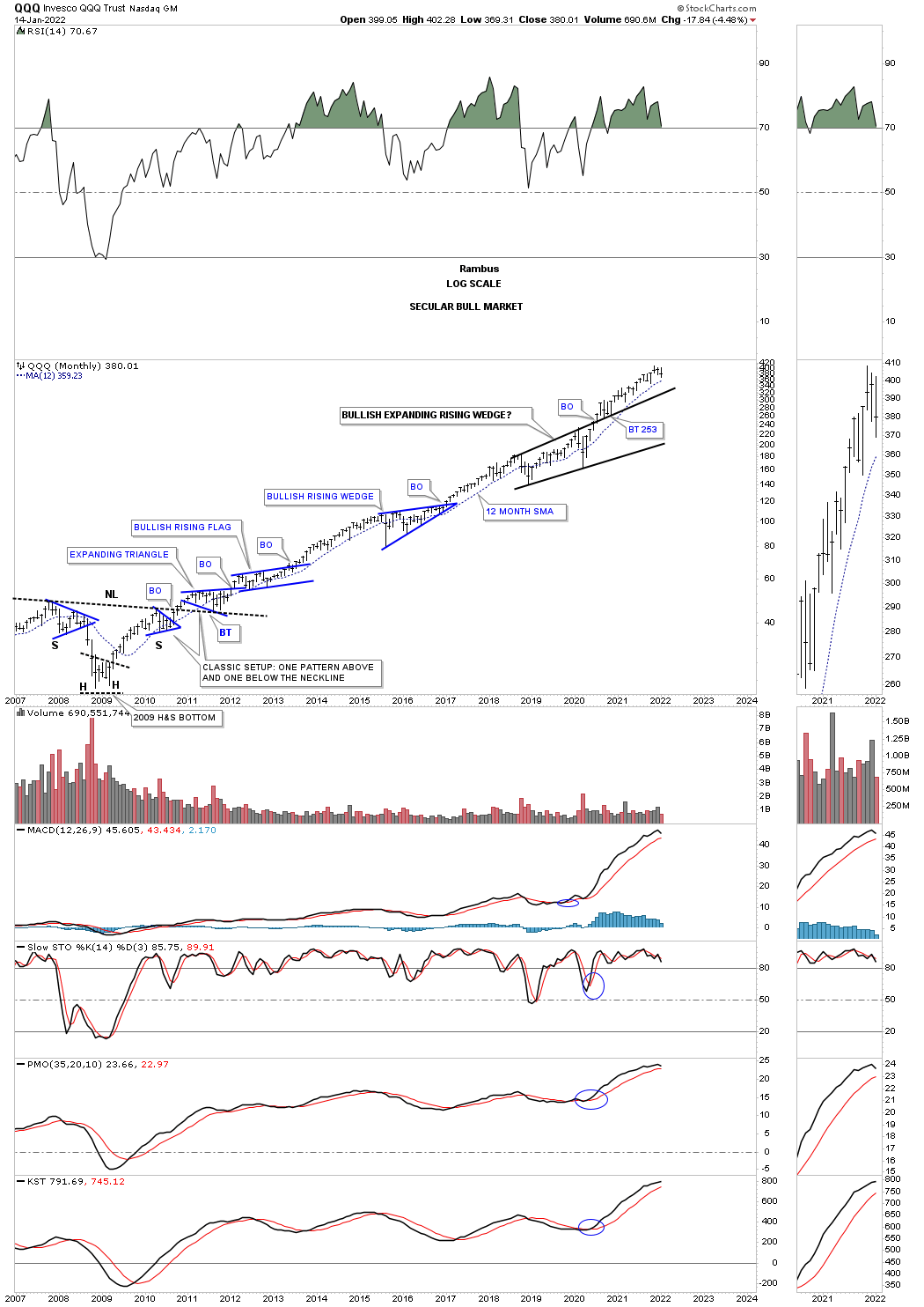
The QQQ monthly chart shows what a classic bull market looks like with one consolidation pattern forming on top of the previous one.
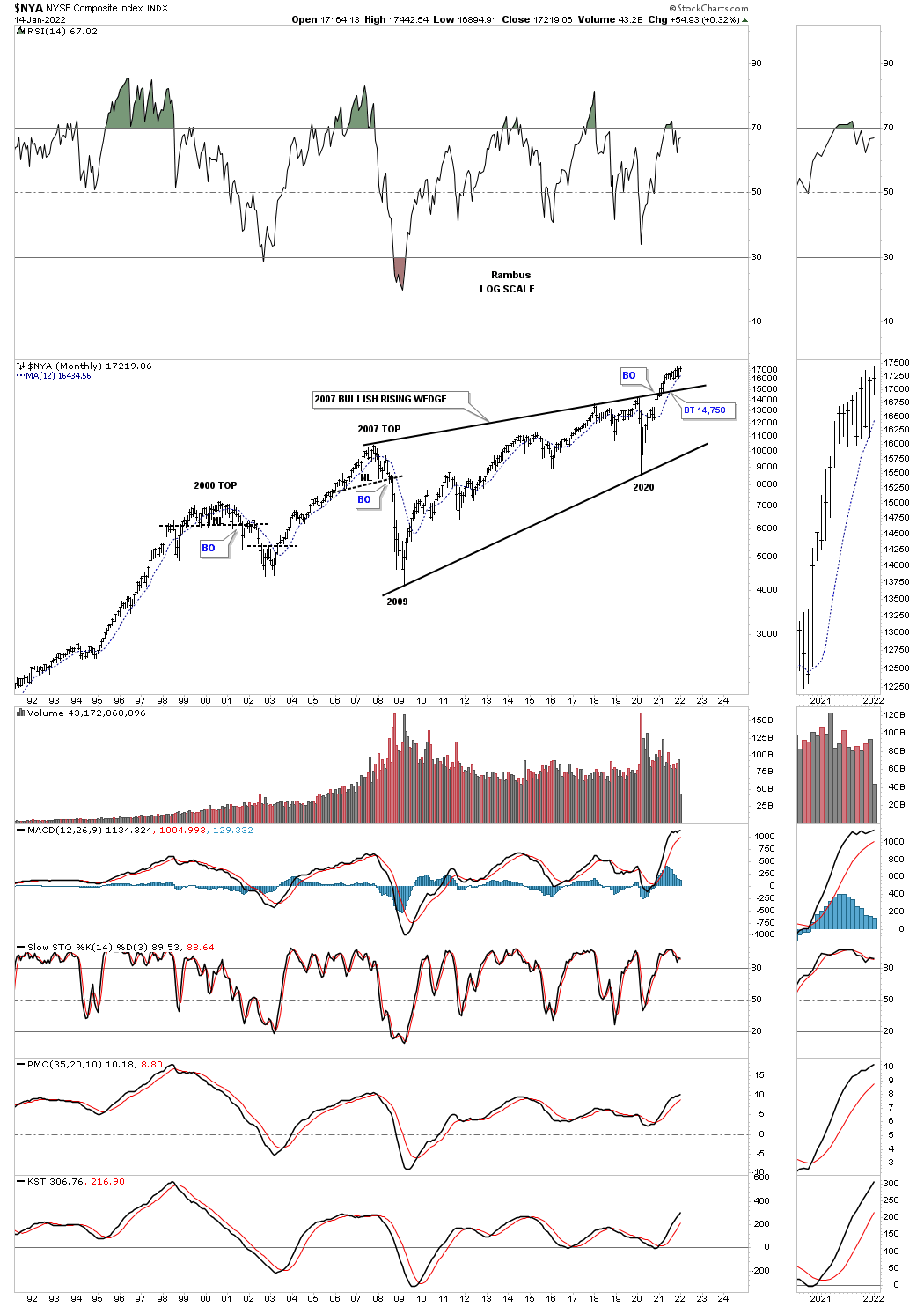
This long term monthly chart for the NYA is a bit different than the SPX and INDU long term charts we looked at earlier. Here you can see the NYA has just recently broken out of a massive 2007 bullish rising wedge.
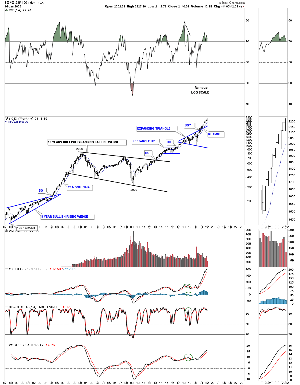
The OEX 100 with its 13 year bullish expanding falling wedge and the seclar bull market that has followed the 2009 crash low.
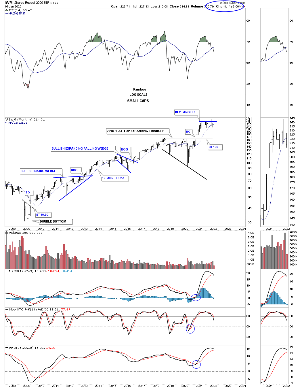
I know it hasn’t felt like it since the beginning of this year but the IWM is forming a rectangle consolidation pattern after breaking out from the 2018 flat top expanding triangle. Note how the 2015 bullish expanding falling wedge formed at about the halfway point during the previous impulse move which is what I believe the rectangle represents.
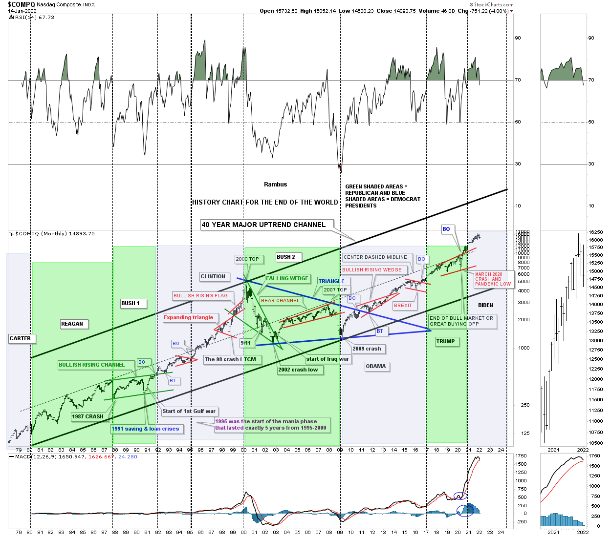
This last chart for the COMPQ I call the, History Chart For the End of the World, which is a satirical look at all the lows which felt like the end of the world if you were trading in real time when they occurred. I last updated this chart at the 2020 crash low and asked the question, “is this the end of the bull market or a great buying opportunity?” So far it has been a great buying opportunity.
Also the green shaded areas show what the stock market did under a republican president and the pink shaded areas show what happened during a Democrat president. I also made this prediction on the day of the 2020 election. I said, it wouldn’t make any difference who was elected president and that the stock market would be higher a year from November 3rd 2020. As you can see that prediction came true on November 3, 2021.
Now for some world stock markets.
I’ve been saying since the 2020 crash low that it wouldn’t be just the US stock markets that are going to rally to new all time highs, but most of the world stocks markets will also follow along for the ride.
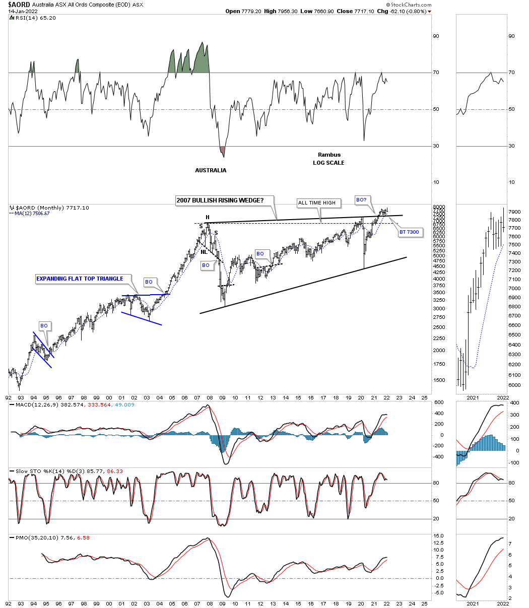
AORD, Australia stock market which is a commodity related stock market that is in the process of breaking out and backtesting the top rail of its 2007 bullish rising wedge.
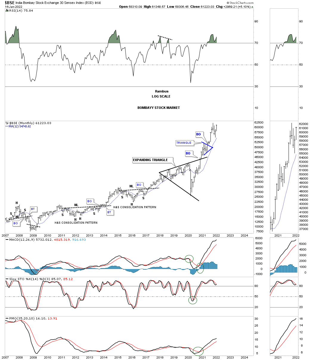
BSE monthly still very strong.
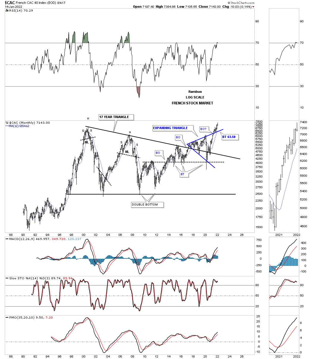
The French stock market CAC has backtested the top rail of its own expanding triangle.
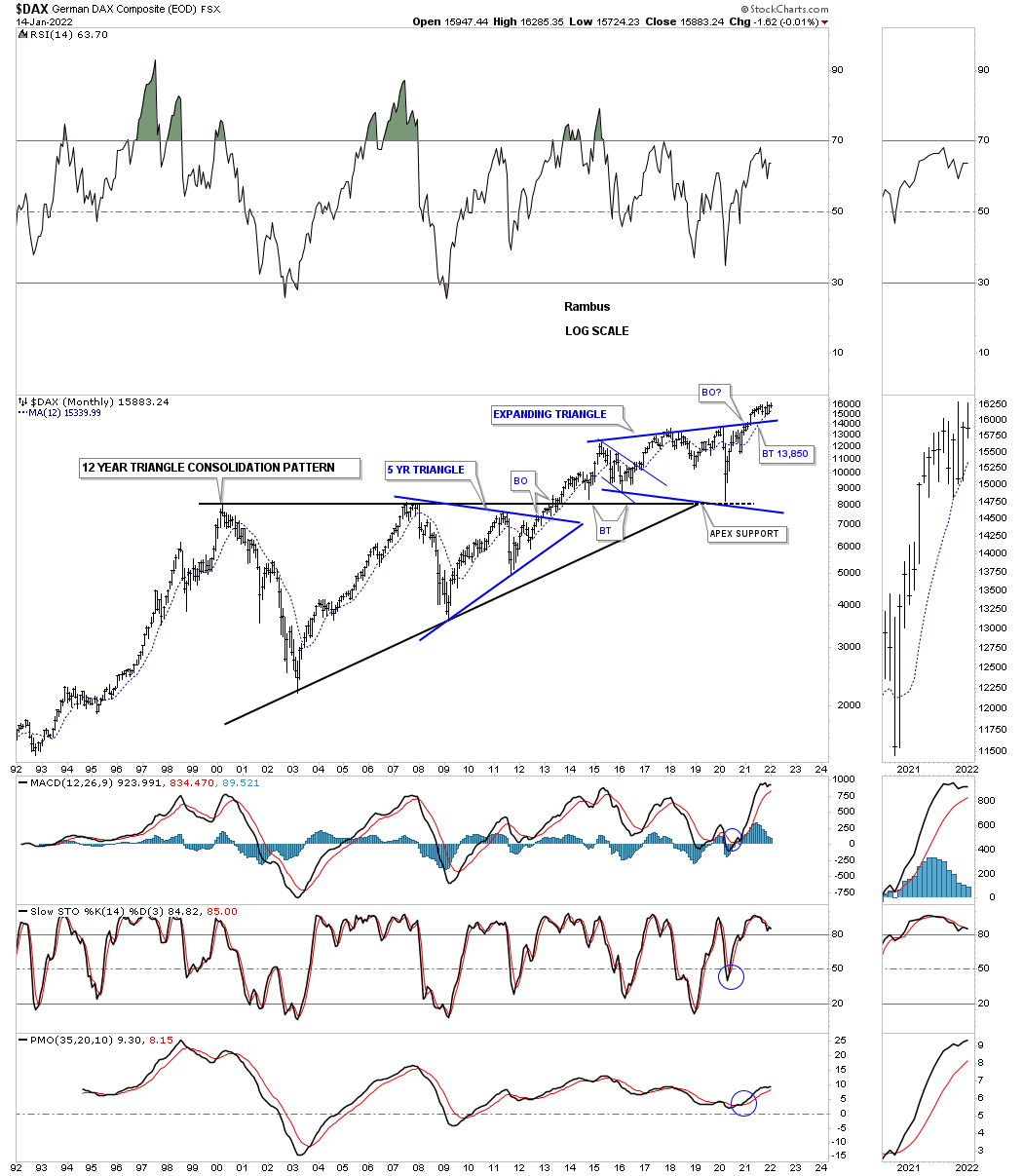
The German stock market DAX in backtest mode?
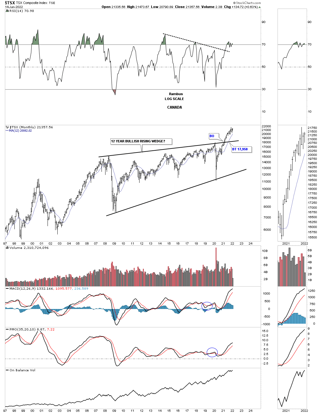
Another commodity related stock market is the, Canadian TSX, which has also broken out from its 2018 expanding triangle and is a bit further along than the AORD.
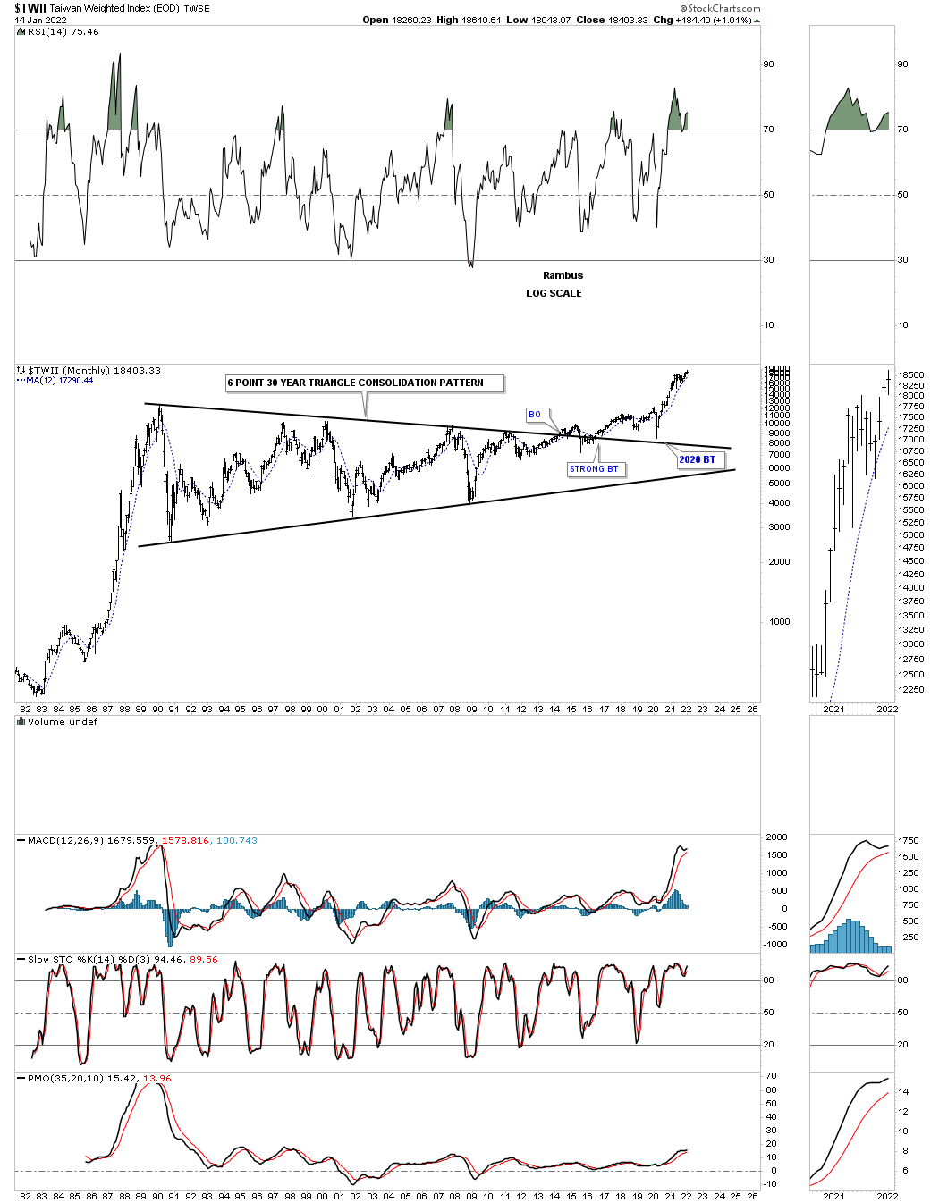
The TWII is the longest consolidation pattern, time wise, that I have ever had the privilege to build which finally came to fruition.
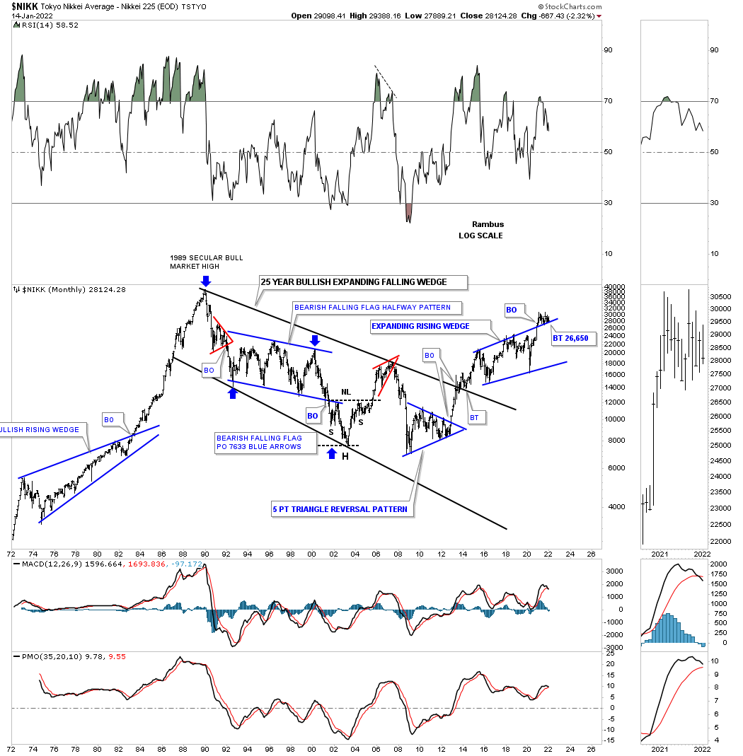
The NIKK is still in backtest mode.
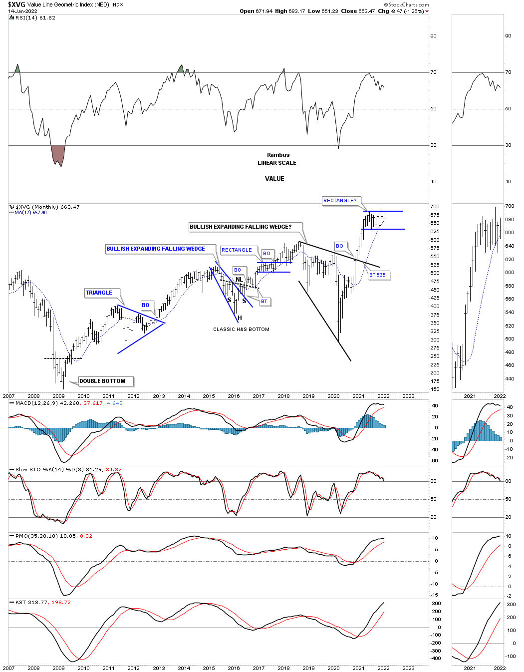
XVG in consolidation mode.
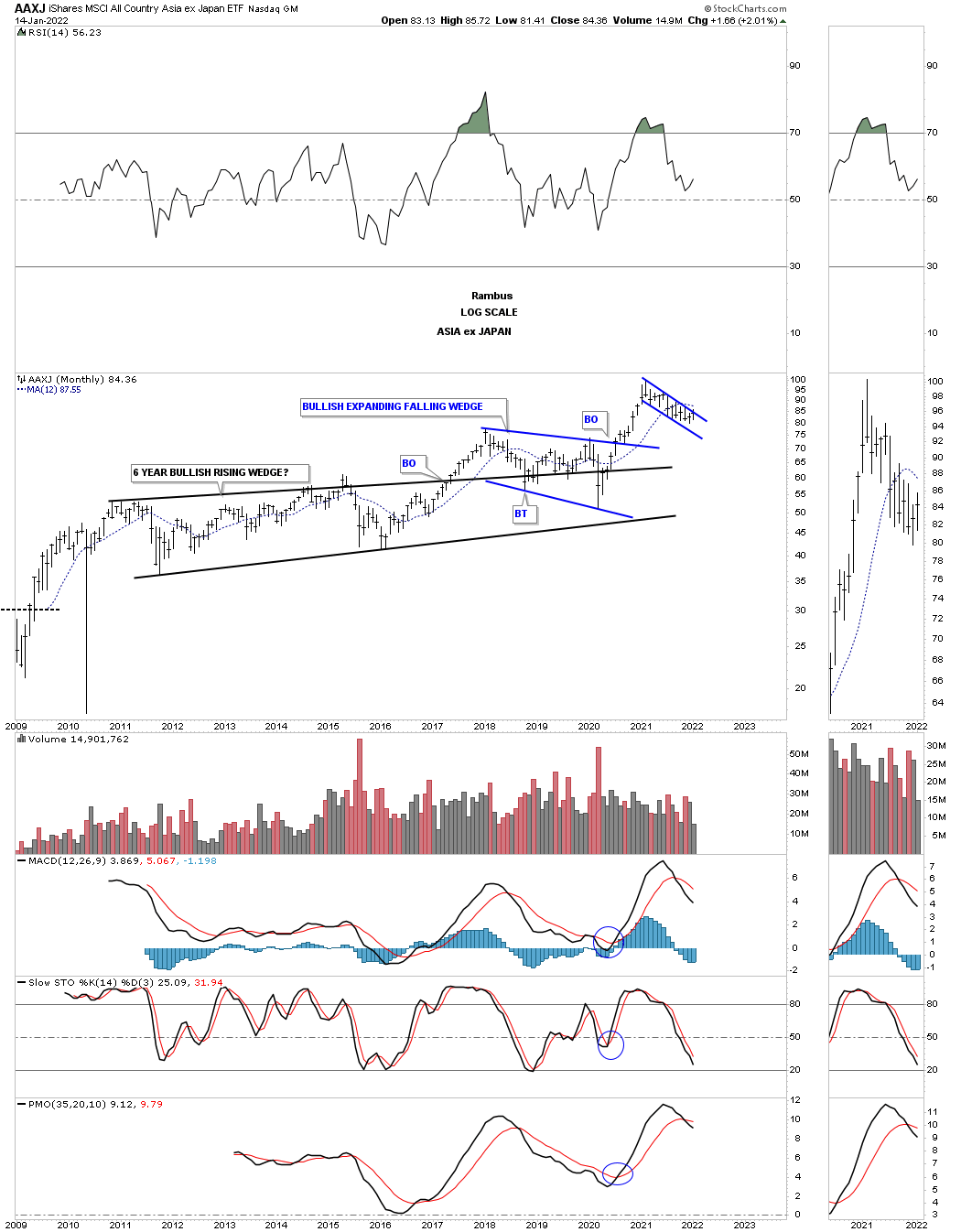
The AAXJ is the Asian stock markets minus the Japanese stock market.
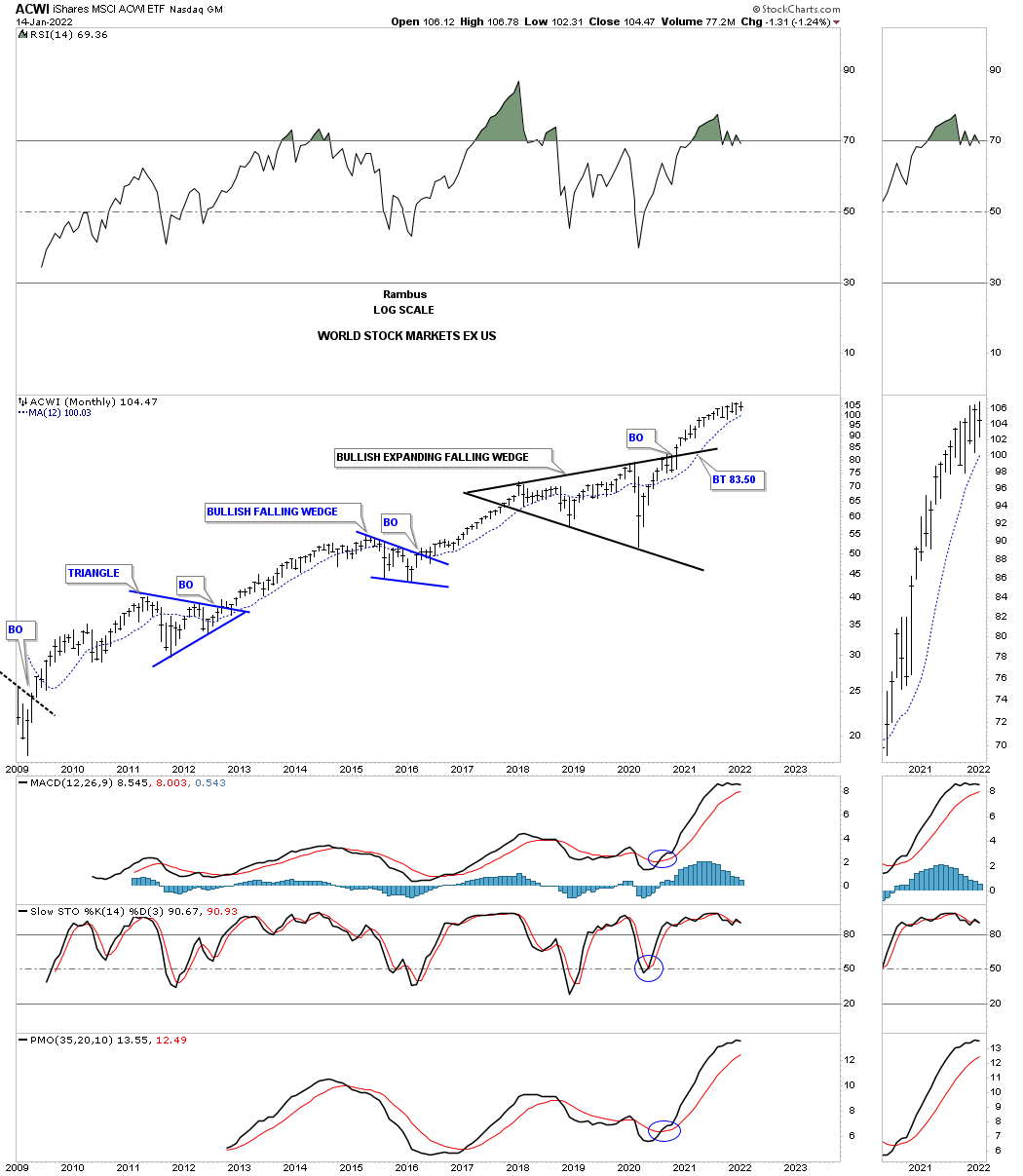
ACWI world stock markets ex the US stock markets.
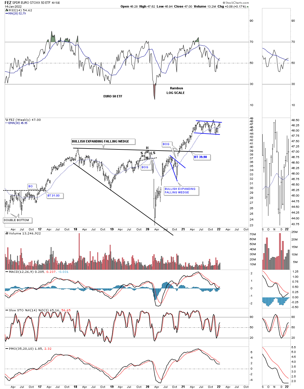
FEZ is consolidating its previous impulse move.
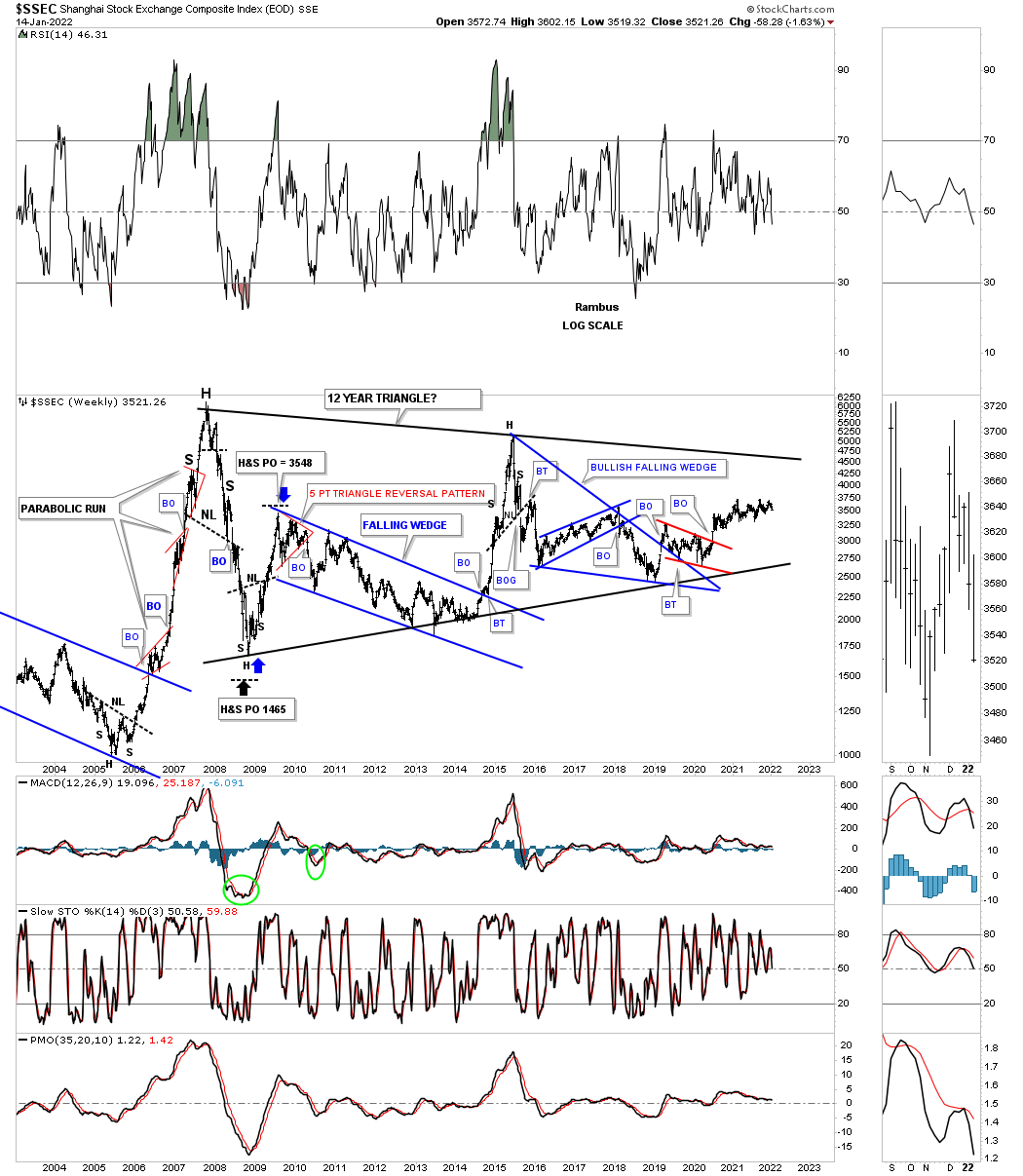
This long term weekly chart for the SSEC, Shanghai stock market, shows you a good example of what happens when a stock or in this case an index goes parabolic. They usually go down faster than they went up and it can take many many years before they ever trade back up to their all time high.
Consolidation patterns are a necessary evil, but absolutely necessary to keep a bull market healthy and viable. The biggest money can be made riding a parabolic move if you understand what is taking place, but most investors won’t understand what is happening until it is too late.
I’ve been a witness to several parabolic moves that ended badly like the top in the Japanese stock market in 1989, the tech bubble in 2000, the oil run to 147 and the SSEC parabolic move high in October of 2007. I know a lot of investors are bearish the stock markets right now and we could see some weakness, but bull markets don’t end with a mediocre rally, they end in a parabolic blowoff which I don’t think we have seen in the US stock markets up to this point.
I have been working on another point of view on why I think the US stock markets still have another 10 years or so left before our current secular bull market runs out of gas which I will share with you down the road. All the best…Rambus
Related Reading:
- Rambus: Blockbuster Chartology – October, 2021
- Rambus: Blockbuster Chartology – July, 2021
- Rambus: Blockbuster Chartology – April, 2021
- Rambus: Blockbuster Chartology – January, 2021
- Rambus: Blockbuster Chartology – October, 2020
- Rambus: Blockbuster Chartology – July, 2020
- Rambus: Blockbuster Chartology – May, 2020
- Rambus: Blockbuster Chartology – January, 2020
- Rambus: Blockbuster Chartology – October, 2019
- Rambus: Blockbuster Chartology – July, 2019
- Rambus: Blockbuster Chartology – April, 2019
- Rambus: Blockbuster Chartology – January, 2019
- Rambus: Blockbuster Chartology – October, 2018
- Rambus: Blockbuster Chartology – July, 2018
- Rambus: Blockbuster Chartology – April, 2018
- 2017 Annual Wrap Up – Does Your Pension Fund Have A Deep State Drain? – January, 2018
- 1st Quarter Wrap Up 2018 Web Presentation
- Blockbuster Chartology with Rambus – October, 2017
- Blockbuster Chartology with Rambus – July, 2017
- Blockbuster Chartology with Rambus – May, 2017
- Blockbuster Chartology with Rambus – January, 2017
- Blockbuster Chartology with Rambus – October 20, 2016
- Blockbuster Chartology with Rambus – July 21, 2016
- Blockbuster Chartology with Rambus – April 21, 2016
- Rambus: Are We in a Deflationary Spiral? – January 28, 2016
- The Dollar, Gold & the S&P 500 with Rambus – October 15, 2015